Minor Slab : Lower Case
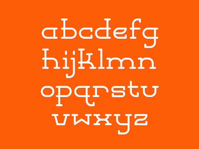
Decided to take a stab at the lower case just for kicks...
Still a WIP > Might increase the overall x-height to balance out the 's' / 'z', etc. Not sure about the 'e' either... But I'm liking bits & pieces of it.

Decided to take a stab at the lower case just for kicks...
Still a WIP > Might increase the overall x-height to balance out the 's' / 'z', etc. Not sure about the 'e' either... But I'm liking bits & pieces of it.