Hydrow - Subscription Revamp
Role: Product Designer
Goal: To create an experience for customers obtaining a subscription with Hydrow without any guesswork on their rowing machine.
Client: Hydrow
Collaborated with: 1 product manager, 2 software developers, 1 director of engineering, 1 CMO, and 1 CSO.
Industry: Fitness tech
About Hydrow: Hydrow is a Live Outdoor Reality (LOR)™ rower, that brings the outdoors into your home with immersive, full-body live and on-demand workouts.
Problem:
Customers were noticing obtaining a subscription seemed to be tedious and as a business, changes needed to be made to the overall process. We needed to update the cost of the subscription, and the general information, and give our customers the ability to transfer their subscription from one Hydrow machine to another.
Tasks
Create a more efficient experience for members to easily get a subscription
Create a user flow for when Hydrow detects a member has a subscription on a different machine.
Actions
Collaborated with the product manager to brainstorm and create user flows, wireframes, and high-fidelity mock-ups of what the subscription UX would look like.
Challenges & Constraints
Creating different user flows for creating a subscription and transferring your subscription from one machine to another.
Designing with design constraints in mind.
Making edits during development when testing the UX/ UI in the tablet.
The Solution
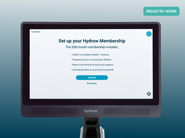
Navigate the user by starting with a CTA page, describing what exactly our customers will be getting out of getting a subscription and why they should subscribe. For example, mentioning “3,000 Live outdoor reality workouts” and workouts led by world-class athletes encourages users to consider paying for a subscription with Hydrow versus not paying for one.
We also came up with a message explaining why they should reconsider obtaining a subscription with Hydrow if they select “no thanks.” If customers don’t subscribe, they won’t have access to live-demand workouts with athletes or tools to track their progress. Messaging such as this encourages users to reconsider denying a subscription with Hydrow.
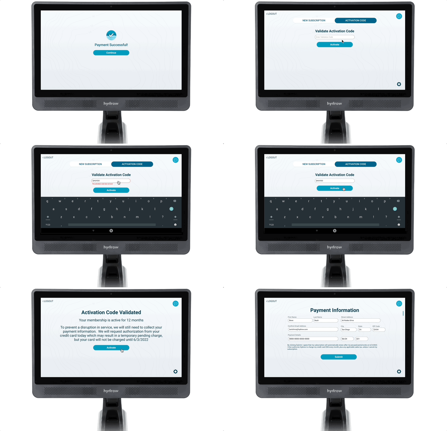
Users could also easily sign up for a subscription on their machine if they received a validation code. The validation code can be retrieved if the user prepaid for your membership or was gifted one.
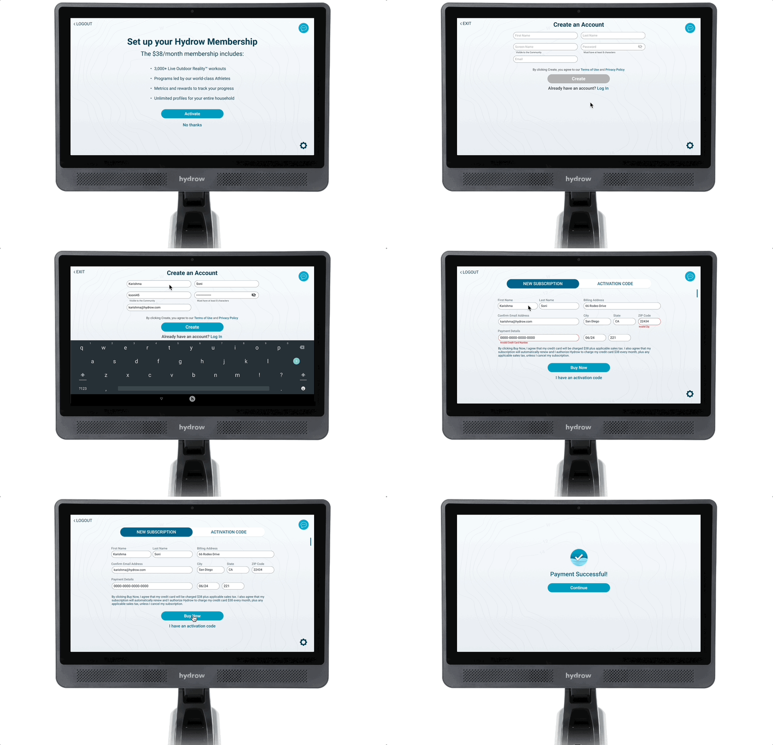
Process of when a user activates their subscription on their Hydrow machine.
Process of when a user uses a validation code to activate their subscription.
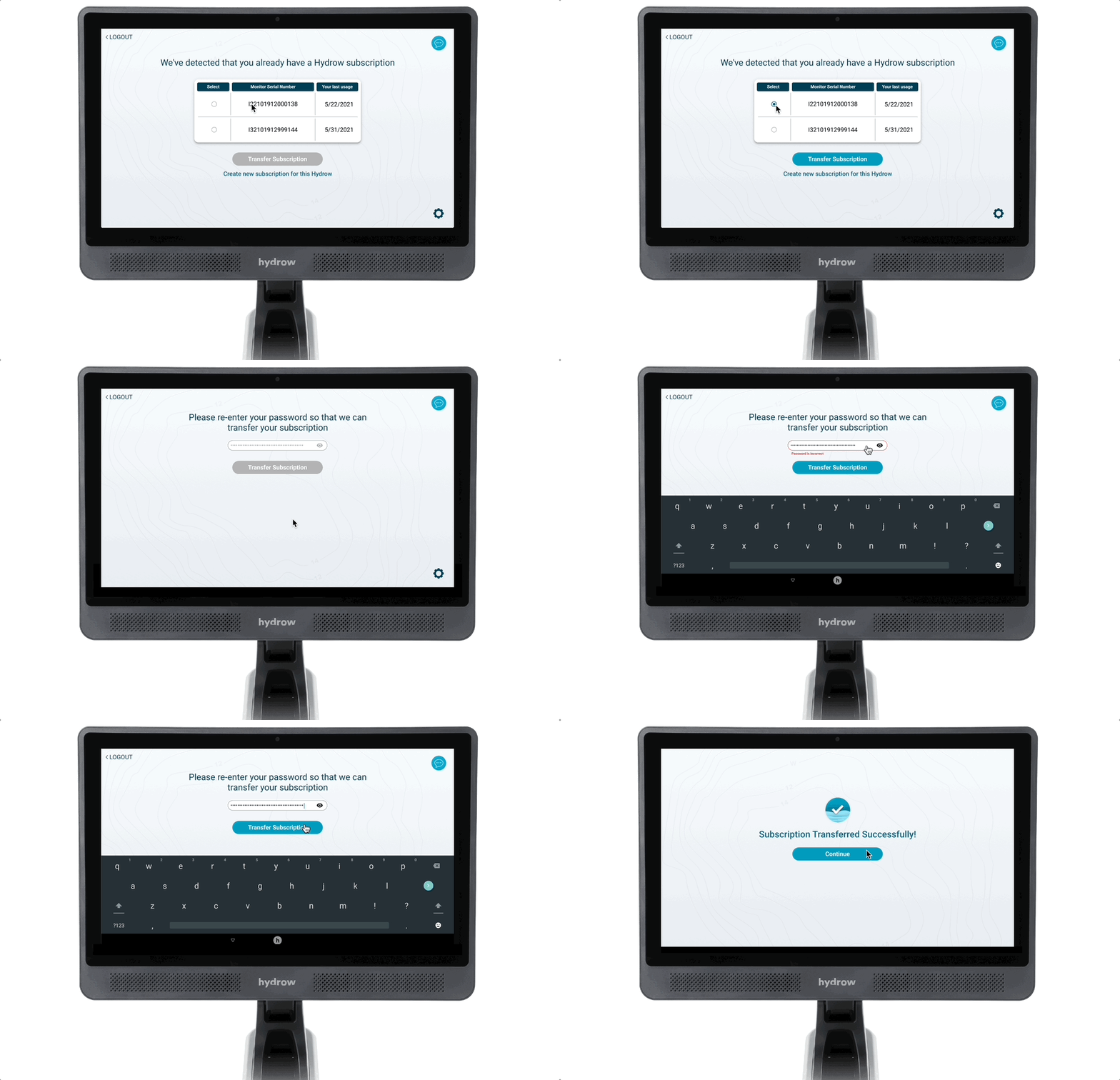
Flow of when a user has a subscription from another Hydrow machine and needs to transfer their subscription to another machine.
The Outcome
We used tabs on the screen to distinguish members who don’t have an activation code and members who do.
Considered creating a similar user journey on the mobile apps (iOS and Android) for members.
One issue we did notice was members were confused on how to cancel their subscriptions. Hydrow typically has members call or email member services.
Canceling a membership on your Hydrow was something we considered creating on the Hydrow but didn’t complete while I was there.
Looking at the design and overall results, I would adjust the UI and have members scan a QR code to take them to their app or a web browser and create a subscription from there.
After testing out the subscription process while sitting on a Hydrow machine, it did seem tedious and challenging to put information in before starting a workout.
Key Metrics
We noticed an increase in subscribers in 2022 with over 200,000 people subscribing to Hydrow.


