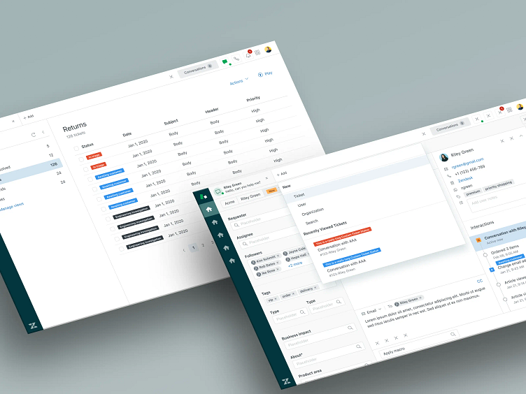
Zen Desk
Process
Understanding the problem
Summary:
Zendesk was rolling out a new feature as an option to their customers using their customer service support software. Custom ticket status allowed users to create their status tags for their tickets in the software in addition to using zendesk's pre-set statuses. The feature had been requested for years and zendesk decided to implement it.
Additional points:
Zendesk's customers were very used to an interface they'd been using for a long time. How do we add CTS (custom ticket statuses) without disrupting their day-to-day necessarily?
The solution had to be easy and obvious without it being intrusive.
We decided that since not everyone would need CTS we made it an optional opt-in.
Clear explanations about what the new solution offered them were a must, therefore we decided to create an onboarding experience for users once they decided to opt in with an option to back out/revert.
The design had to integrate and function within Zendesk's very mature garden UI system.
Wireframes
Below is my initial exploration for the solution. There was no need for a wireframe with this project since Zendesk has a very mature UI system. I wanted to start at the point the user would create a new ticket status within their dashboard. This helped me think through some small problems that I didn't anticipate such as the names of the ticket status potentially being very long. I had to adjust the layout later.
User Testing
Research
Zendesk is a large company and as such is constantly conducting user testing with potential features. I had access to the research done on CTS before I began the project and reviewed the input.
Results
Users with niche businesses had a greater need for CTS.
We needed to accommodate and/or cap CTS field labels as some could be quite long
Testing with a basic initial option to a few beta testers yielded positive results but the UI and flow needed adjustment which is where I came in.
Final Designs
Once I worked the kinks out with the flow and ticket labels. I rendered high-fidelity designs of the feature to ship to the dev team
Details
The design utilized very mature and developed UI patterns that zendesk had defined over years of use.
Presented an new challenge as this was the first time I had worked with such a rigid design system. It was a great exercise for problem-solving though.
As part of this assignment, I had to port Zendesk's framework from Sketch to Figma. I updated everything and added auto-layout to the components where necessary.
In addition, I was tasked with creating onboarding screens. This needed to include a space for their animators to add an animation. I got permission to create a prototype and took the opportunity to learn how to animate a vector design in after-effects and then convert to lottie animation.
The final designs make it really easy for users to opt into CTS and start filtering their projects more effectively.


