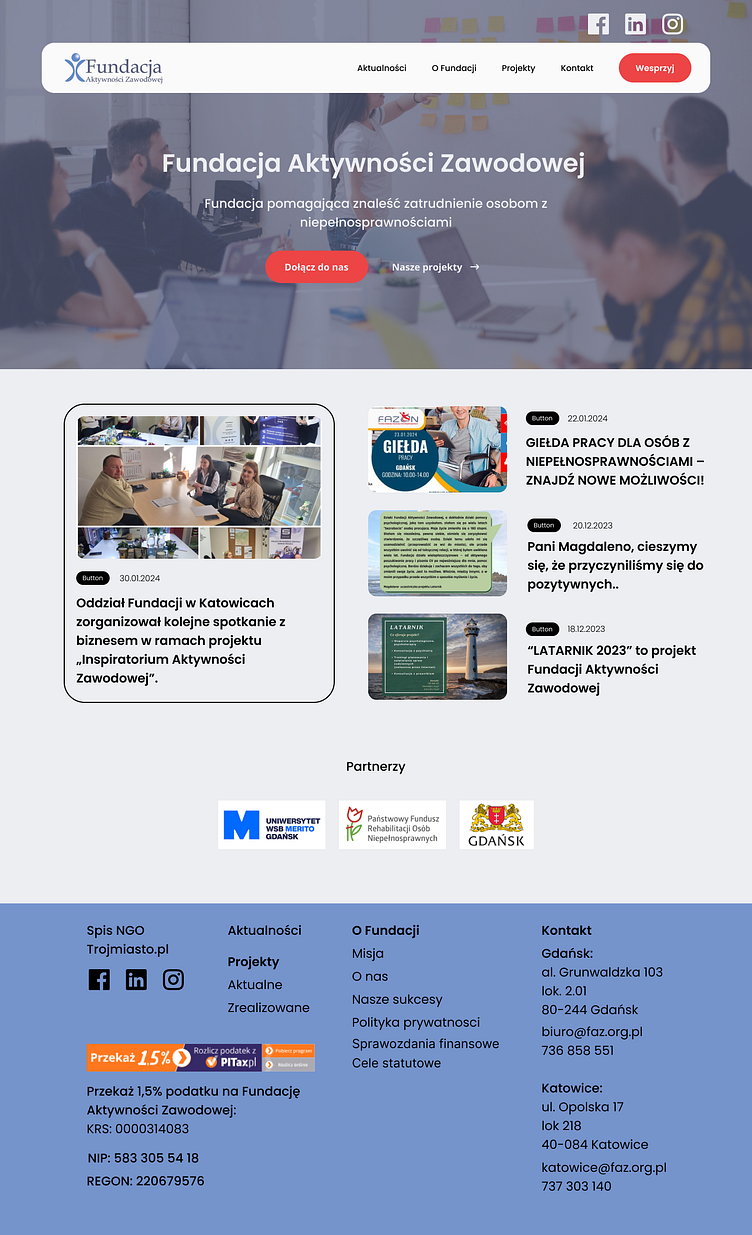
My Project for the Vocational Activity Foundation
I am thrilled to present my latest project - the website for the Vocational Activity Foundation. It was not only a unique challenge but also an incredibly inspiring experience. My aim was to create something that not only catches attention but above all, is functional and accessible to all users, regardless of their abilities or limitations.
Solved Challenges: The first challenge I faced was understanding the diverse needs of our potential users. I had to strike a balance between aesthetics and functionality, as well as ensure accessibility for people with various disabilities. Through meticulous user research and usability testing, I managed to identify and solve many potential issues already during the design phase.
Imposed Color Palette: A key element of my project was the imposed color palette. I had to adapt to the existing branding of the Foundation, which was a challenge but also a great opportunity for creative use of available resources. I created a harmonious combination of colors that not only emphasized professionalism but also encouraged interaction and exploration of the website.
Layout and Minimalism: Guided by the principle of "less is more," I opted for minimalism in the website layout. My goal was to ensure readability and ease of navigation while eliminating unnecessary elements that could distract the user. By focusing on essential information and a clear layout, I aimed to create a space that is pleasing to the eye and easy to use for everyone.
Accessibility: Ultimately, one of my main priorities was to ensure the accessibility of the website for all users. I made sure that the site complied with the latest accessibility standards, taking into account the diverse needs of people with disabilities, such as screen readers, keyboard navigation, or accessibility for people with visual impairments.
I am proud of the results of my work, and I hope that the Vocational Activity Foundation website will not only meet expectations but also serve as inspiration for other projects that prioritize minimalism, accessibility, and solving user problems.

