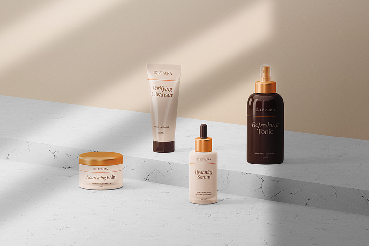
le' Aura - Cosmetics Packaging Design
Final and chosen concept for le' Aura - (brand name inspired by owner’s - Laura), a Croatian skincare brand which products are crafted with a touch of coastal magic, delivering a radiant aura to your skin.
The chosen logo is a combination of simple yet bold 'stamp' with letter 'a' and also luxurious wordmark which conveys hiqh quality.
Every product has a golden line/aura around itself to represent brand's name and story throughout every element.
The brand color scheme comes from a combination of sandy tones, but also refers to the variety of human's skin colors.
Feel free to reach out anytime for a free brand consultation:
Skype: Insigniada
More by Insigniada - Branding Agency View profile
Like
