Story of our Rebranding
Project Brief
Our previous branding was somewhat limiting and didn’t align with our current aspirations, goals, and plans, which include expanding into new sectors and markets.
Over the years, we’ve significantly extended our expertise in specific industries and we operate as a business and technology partner to our clients.
The process of change, initiated several weeks ago, has led us to a point where we firmly believe that Blurify better encapsulates our brand and identity. We see it as the culmination of our experience, specialization, work ethos, and the values upheld within our team.
The new name and visual elements represent a significant step forward. In line with our new slogan, “Software Solutions for Tomorrow,” we’re boldly looking ahead and expanding our reach into new markets and sectors.
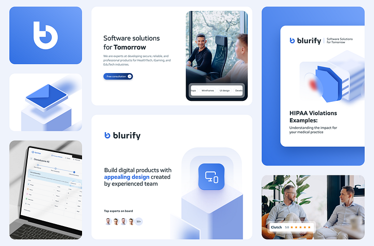
To refresh our image properly and maintain brand consistency, we’ve also overhauled our visual identity, as is evident on our website, social media, and all marketing materials.
“When working on the logo, our main focus was to create a distinctive and powerful symbol. We opted for the simplicity of a geometric shape resembling the letter ‘b,’ combined with a contemporary font style. We also incorporated elements of blur into the logo, directly referencing the brand’s name and specialization. Finally, we added some distinguishing elements to the letters used in the symbol to further emphasize the individualism and uniqueness of the new brand.“ – said Bartek Klamka, UI/Graphic Designer at Blurify.
Read full case study here: https://blurify.com/blog/say-hello-to-blurify/


