Portfolio 2.0
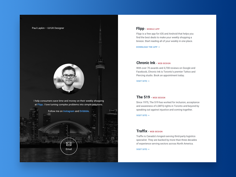
Now that I've become more established in my career—I wanted to play around with some different ideas for my portfolio (that focuses less on my work and more on my accomplishments).
This one takes the minimalist approach. It's simple, clean, and emphasizes beautiful typography. Kind of like a profile card, but for your work.
Critique is always appreciated. Thanks!
– – –
Press L to show some love.
More by Paul Lapkin View profile
Like

