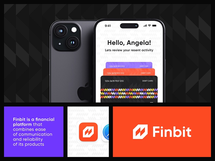
Finbit - Branding for the fintech platform
Building a Brand Image as Diverse as its Users
Imagine a financial platform that speaks your language, literally and visually. That's Finbit, where seamless communication meets dependable service, reflected perfectly in its new brand identity.
Logo Design
The logo features stylized banknotes intertwined inside a globe, representing global reach and making it a conversation starter. It's a bold symbol of connection and security, setting the stage for clear communication between Finbit and its users.
Diversity in Design
Don't be fooled by the logo's simplicity. Hidden within are intricate patterns, each representing different product areas and customer segments. This visual tapestry celebrates Finbit's versatility, ensuring brand unity even as they expands.
Color Confidence
Forget the bland corporate palette. Finbit embraces a spectrum of colors, each assigned to specific areas of the business. It's a strategic yet vibrant approach, making them instantly recognizable while retaining overall brand cohesion.
Beyond Beauty
The patterns aren't just pretty faces. They dynamically adapt to different contexts, fulfilling both external branding needs and internal team differentiation. Colors and combinations create a clear hierarchy, keeping everyone on the same page.
Impactful Accents
Black forms the foundation, while bright accent colors add a punchy, dynamic contrast. This eye-catching combination guarantees faster consumer recognition, etching Finbit's image firmly in their minds.
The Verdict
Finbit's brand identity is rich, dynamic, and powerful, just like the future they're building. It's a testament to their commitment to clear communication and celebrating diversity, both within and beyond their user base.
hello@outcrowd.io
🌐 outcrowd.io
Don’t let your brand image get lost in the noise.
With design and branding, Outcrowd helps to reveal the essence of your brand and transform it into a powerful force that excels in results.
Become a part of Outcrowd communities:


