Sorinex | CRO
In today's day, there are a lot of ways to work out. For me, I need to be at the gym with solid equipment to meet my goals. Using good equipment like Sorinex® can make the difference in hitting your fitness goals for 2024. See the thread for the breakdown!
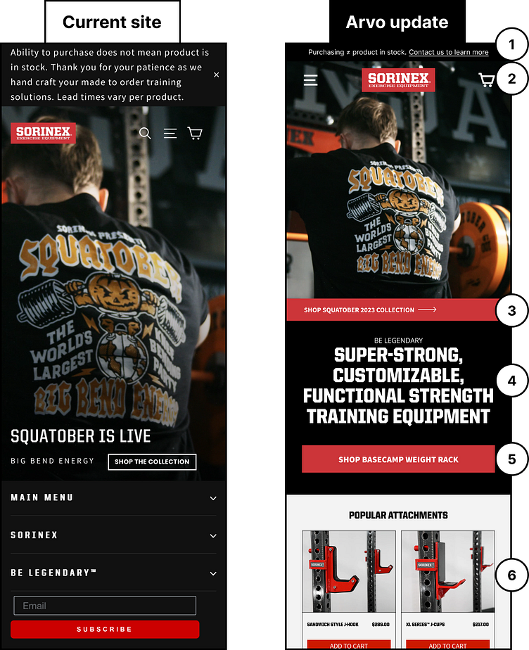
1) Don’t overcomplicate the announcement bar. Keep it simple and to the point and include a CTA link to drive users to interact.
2) Pay attention to the spacing of interactive elements. Keep the main navigation separate from the cart as users can miss click when items are too close together and this can cause frustration and a reduction in conversions.
3) Add a secondary CTA that will take them to the product that is featured on the hero image. Directing interested users to the actual product page increases the chances of conversion!
4) The current headline doesn’t communicate what or who Sorinex is. Provide a headline that states what goods you are selling as not every visitor is going to be aware of the great products you are selling.
5) Give users a clear CTA to click on to get them into your purchasing funnel. Make sure it is labeled to give users an indication of what to expect after clicking on the CTA. Providing clear direction for a user to take will equate to higher conversions.
6) Consider adding some of the best-selling items from your store to the front page. Users are often enticed to buy items that are proven top sellers.
