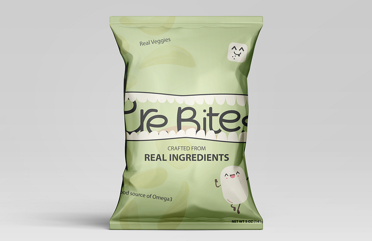
Pure Bites Chips Brand Packaging Design
Hey Everyone 👋🏻
I made this clean packaging design to reflect real goodness packed inside every bag. With a vibrant smiling potato chip illustration, I wanted to convey the joy that comes from knowing you're enjoying a snack crafted from real ingredients and real veggies.
I've decided to name the brand Pure Bites.
Hope you like it. Thank u very much for your support.
--------------------------------------------------------------
📩 I’m available for freelance work peterhronec0@gmail.com
You can also check my socials :)
Stay Safe
The colors for Pure Bites were picked carefully to match what the brand stands for. Black is like a strong base, showing that the brand is timeless and trustworthy. The warm brown is cozy, like the natural goodness in our snacks. The soft green is calming and represents the fresh veggies we use. The light green is lively, showing that our snacks are full of good stuff. The warm off-white is simple and pure, just like our snacks. Altogether, these colors make Pure Bites look real, warm, and delicious.

