Instagram Profile Page Redesign
Hello there 👋
I completed my UIX101 #006 assignment 😊
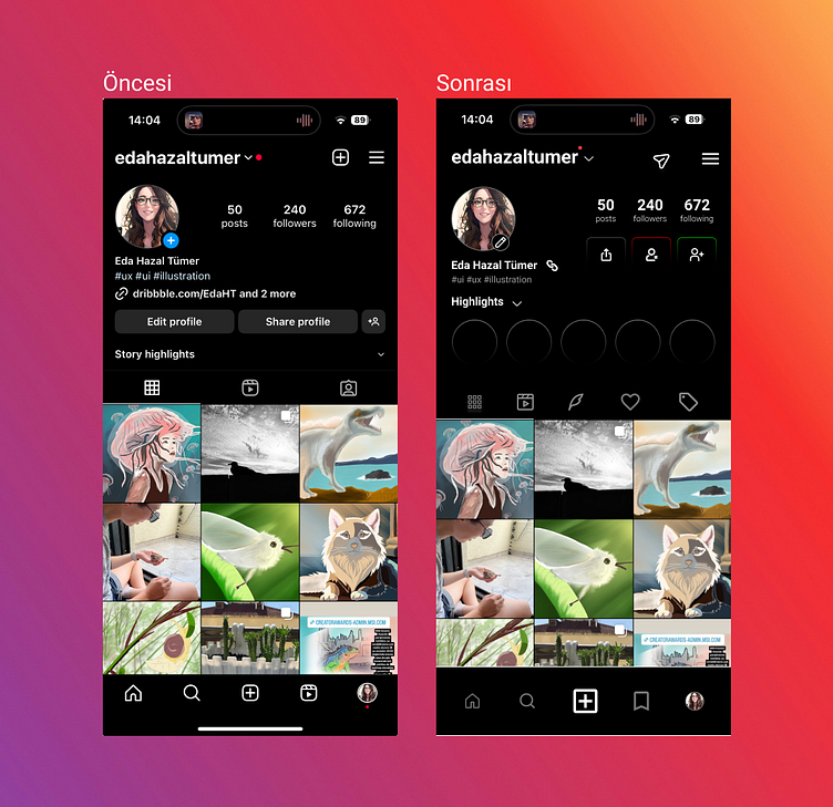
In this task, the redesign of an Instagram profile page was required. I contemplated how I would do it and tinkered with some disliked aspects.
Ultimately, it seems that this time, the user perspective outweighed the designer's view. Throughout this process, I realized that I generally like the overall look of the Instagram application and based my own profile view on it.
Firstly, being a lover of dark mode, I am quite content with the background color, so I didn't make any changes there.
Let me go from top to bottom:
Firstly, I replaced the "new post" button with a "send message" icon. I opted for it to be easily accessible from the bottom navigation menu, considering that having only one prominent "new post" button would suffice (Considering the increasing size of phones).
I made slight size adjustments, emphasizing numbers over captions in the post, follower, and following sections, allowing users to read them more comfortably.
Initially, having personal links visible seemed practical. However, if you have multiple links, only one appears on the profile. So, instead of occupying space here, I considered hiding them within an icon. Thus, space was freed up on the page. Also, since these links are user-related, I placed them next to the user's name.
I found the "share profile" button to be taking up too much space. I reduced it to an icon. Right next to it, I placed buttons for adding and blocking people. I believe that having these buttons easily visible on the profile is essential because they are two of the most basic features for a platform focused on photo sharing and networking.
I don't use the Highlights section much, but many people do. So, by using only a semi-visible frame, I aimed for a more spacious page view for those who do not use this section. For those who do, nothing has changed.
I accidentally discovered that you enter the Story section from the profile photo 🙈 Therefore, I thought that such a commonly used feature should be more prominent. Thinking it would be easier for someone who is new to Instagram or registering for the first time, I placed it next to the photo album and reels. Right next to it, there are "favorites" and "tagged" sections.
I highlighted the most important third feature, the "new post" button, in the bottom tab. Also, it would be practical to save resources and easily find them later. So, I added a button for saved items to the bottom tab.
If you have any "I wish Instagram was like this" or anything you'd like to say, I'm waiting for your comments. 🌸 👇