App Switcher - Case Study
App Switcher
Shared Web Component for Gainsight
Overview
Gainsight, a prominent Customer Success platform, has recently expanded its offerings with the introduction of two new products.
Currently, customers can access up to four distinct products, each offering multiple instances. An instance represents a separate account within a product, enabling users to manage various aspects such as tracking their own products within the Gainsight platform. Instances are created by Gainsight after purchasing additional subscriptions.
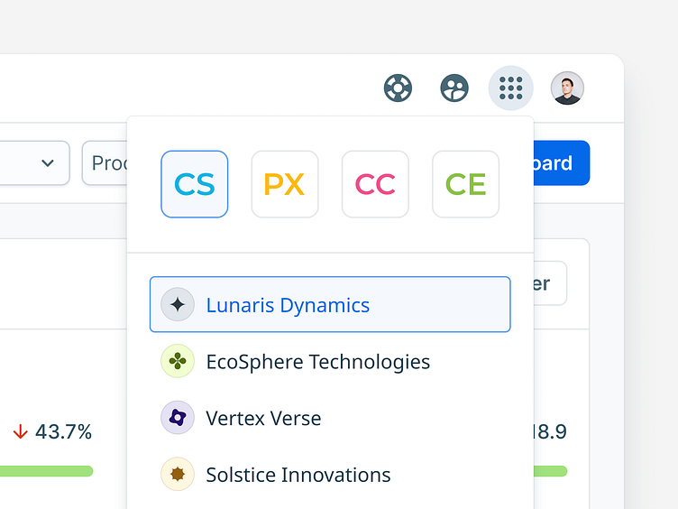
To enhance user experience and streamline navigation, I designed a new shared component facilitating seamless product switching for customers.
The Concept
To design this component, I've conducted thorough analysis to account for various scenarios, recognizing that not all customers utilize all four multi-instance products.
The solution entailed the design of a modular component comprising two primary elements:
header for product selection
list for instance switching.
This approach successfully addressed all identified corner cases:
When a customer has access to fewer than four products, the product icon is hidden. However, a provision for potential upsells was integrated by leaving room for a grayed-out icon. Clicking on this icon in the future could redirect users to the respective product landing page, providing insights into its features.
In scenarios where a customer possesses only one product with multiple instances, the App Switcher header remains hidden. Upon clicking the icon, the list of instances is directly displayed.
If a customer has only one product with a single instance, the App Switcher is entirely omitted from view. Consequently, the icon in the header is not visible.
Determining the default number of visible instances required careful consideration, informed by analytical data. By analyzing the average number of instances across each product, a decision was made to display a maximum of five instances by default. In instances where customers possess more than five instances, the list seamlessly accommodates additional entries through scrolling functionality.
Below are examples illustrating some of these scenarios:
Small Tweaks
Having established the definitive layout, attention was directed towards designing the interactive states of clickable elements.
Ensuring readability, particularly for lengthy instance names, was a priority. To address this, text is trimmed appropriately, with a tooltip revealing the full name upon hovering.
Additionally, I've conducted UX research to determine the desired interactions following user clicks:
hovering over a product icon triggers the display of a list of instances.
clicking on an instance from the list opens it in a new browser tab.
These refinements were implemented to enhance user experience and streamline navigation within the platform.
Finalization
Lastly, the preparation of a comprehensive hand-off document for front-end developers facilitated smooth implementation. This was facilitated by the detailed specifications I prepared, exemplified below.
✦ The dashboard view presented here is modified for this case study and doesn't include real data. Present and future Gainsight products appearance may differ.


