UX/UI Design for a Play-to-Earn Card Project
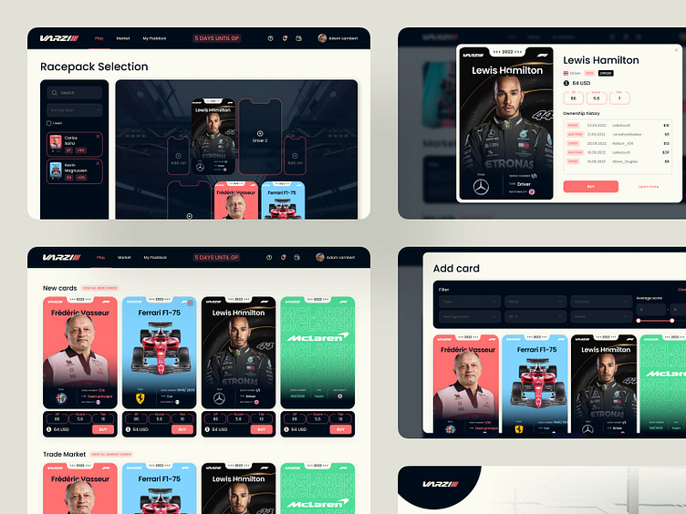
Introducing my latest UX/UI design project geared toward the adrenaline-pumping world of motorsports. This concept fuses sleek aesthetics with vibrant accents to create a dynamic user interface that embodies the speed and precision of Formula 1 racing.
The interface boasts a minimalist yet bold approach, using sharp lines and a contrast-rich color palette to highlight key information, fostering an intuitive user experience.
The spotlight shines on our card designs, where the stats of each driver and team car come to life against a backdrop of lustrous graphics and crisp typography. Each card is a blend of functionality and visual appeal, providing essential information like team affiliation, driver ratings, and pricing in a glanceable format.
The Trade Market section is a testament to our commitment to creating user-centric designs. It's equipped with a robust filter system that allows for effortless sorting by type, rarity, and country, ensuring that users find the perfect addition to their collection with ease.
The meticulous attention to detail in the UI elements, from the toggle switches to the action buttons, ensures a cohesive and engaging user journey.
It's an immersive experience that captures the essence of F1 racing through its visually striking components and user-friendly interface. It's a project where every pixel is charged with purpose, and every screen is a gateway to the user's next strategic move in the exciting world of digital collectibles.
Don't forget to press 'L' if you like it.
