Case Study: AAEH Conceptual Redesign by Cox Code
Introduction
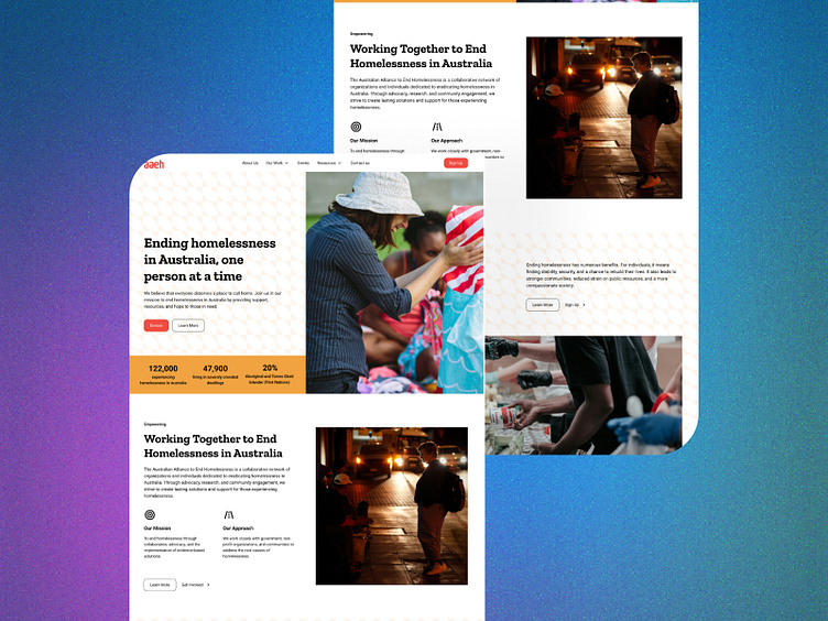
At Cox Code, we are committed to demonstrating our proficiency in creating modern and impactful digital experiences. To illustrate our design philosophy, we undertook a conceptual redesign of the Australian Alliance to End Homelessness (AAEH) website, executed entirely within Figma to showcase what a contemporary, user-centric website for the organization could look like.
Conceptual Redesign Rationale
The AAEH, with its noble mission, deserved a digital platform that could effectively communicate its vision and engage its audience. Our goal was to create a design concept that was not just aesthetically pleasing but also functionally superior, emphasizing the urgency of their cause.
Design Strategy
Our design team approached this conceptual redesign by focusing on several key aspects:
Modernization
We aimed to refresh the AAEH website with a modern look that conveys clarity and focus. By stripping away any dated elements, we introduced a sleek and sophisticated interface reflective of the organization's forward-thinking approach.
Mobile Responsiveness
With mobile-first browsing becoming the norm, we ensured our design was responsive, providing an optimal viewing experience from desktop to handheld devices.
Color Scheme Enhancement
We expanded the AAEH's color palette to include analogous shades of red, orange, and yellow. This choice was strategic, aimed to evoke warmth and optimism, resonating with the organization's core message of hope.
Engaging Hero Section
The hero section is the first engagement point for visitors. We designed this area to be immediately captivating, with a clear and persuasive call-to-action (CTA) that encourages participation and support.
Authority in "Our Board" Section
Knowing the importance of trust and leadership in nonprofit organizations, we crafted the "Our Board" section to present the members with authority and professionalism, underpinning the organization's credibility.
Outcomes
While this redesign remains a high-fidelity prototype and has not been developed into a live website, we believe our concept captures the essence of what a modern, user-friendly, and mission-driven website should be. The use of Figma enabled us to iterate quickly and present a tangible vision of the site's potential, setting a benchmark for future development.
Moving Forward
At Cox Code, we pride ourselves on translating digital ideas into reality. This conceptual redesign is a testament to our commitment to excellence and innovation in the digital space. Should the AAEH or similar organizations wish to actualize this concept, we stand ready to bring our expertise to the forefront, ensuring a seamless transition from design to development.
For any inquiries or to discuss how we can transform your digital presence, please do not hesitate to schedule a consultation with us @ https://www.coxcode.io/contact


