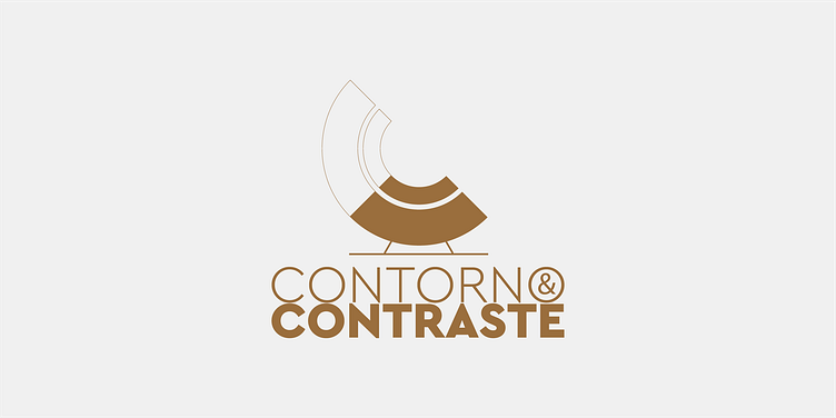
Contorno&Contraste
Visual Identity
—
CHALLENGE
Contorno&Contraste its a house/interior renovation company, that aims for a medium-high population target.
In the briefing, I was told that the brand was also headed to commercializing a certain type of chairs and that the logotype should be part of it on a small rectangular label.
The identity isotype/mark was built around the initial letters of the brand, the C's, displayed in a conceptual manner. One half is stroke (which means Contorno) and the other half is pure contrast/color (which means Contraste).
Just like the isotype/mark, the logotype follows the same conceptual thinking. The word Contorno (Stroke) is displayed as a light typographic weight and the word Contraste (Contrast) is displayed as a bolder typographic weight.
—
CLIENT
Contorno&Contraste
Felgueiras, Portugal


