Fences one page website - AI enhanced creativity
AI in the service of finding savings
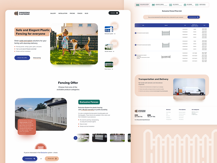
This is a website featuring the full range of products from a local fence producer. The company is relatively young, so the limited budget must be spent on a fast website with a well-organized hierarchy to effectively showcase the wide variety of fences, rather than hiring a logo designer, a professional photographer, and even an SEO writer.
Let me reintroduce scope of Artificial Intelligence work:
Logo (with some small color and spacing adjustments)
Small fence photos in the sidebar
Copy hierarchy (dividing text into headings and bullet points)
All other elements, such as icons and graphic design, were created using the power of the human mind.
Conclusions from work with AI
AI tools often make many mistakes both in terms of UX principles and graphic design. Correct automation doesn't always yield desired results, although it can certainly fill (temporarily) the gaps created by the lack of availability of specialists in certain fields (such as photographers, logo designers, copywriters) due to various reasons - for example, financial constraints. Proper use of the tool and graphic editing of AI-generated outputs can accelerate and streamline designers work.


