GROWTH HOUSE | Logo Design & Brand Identity
GROWTH HOUSE
SEO Consultant
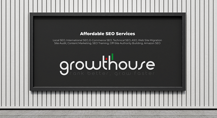
At Growth House, we are committed to helping our clients achieve online growth and success through our exceptional SEO services. Our logo reflects this mission, embodying the values and approach that guide our work.
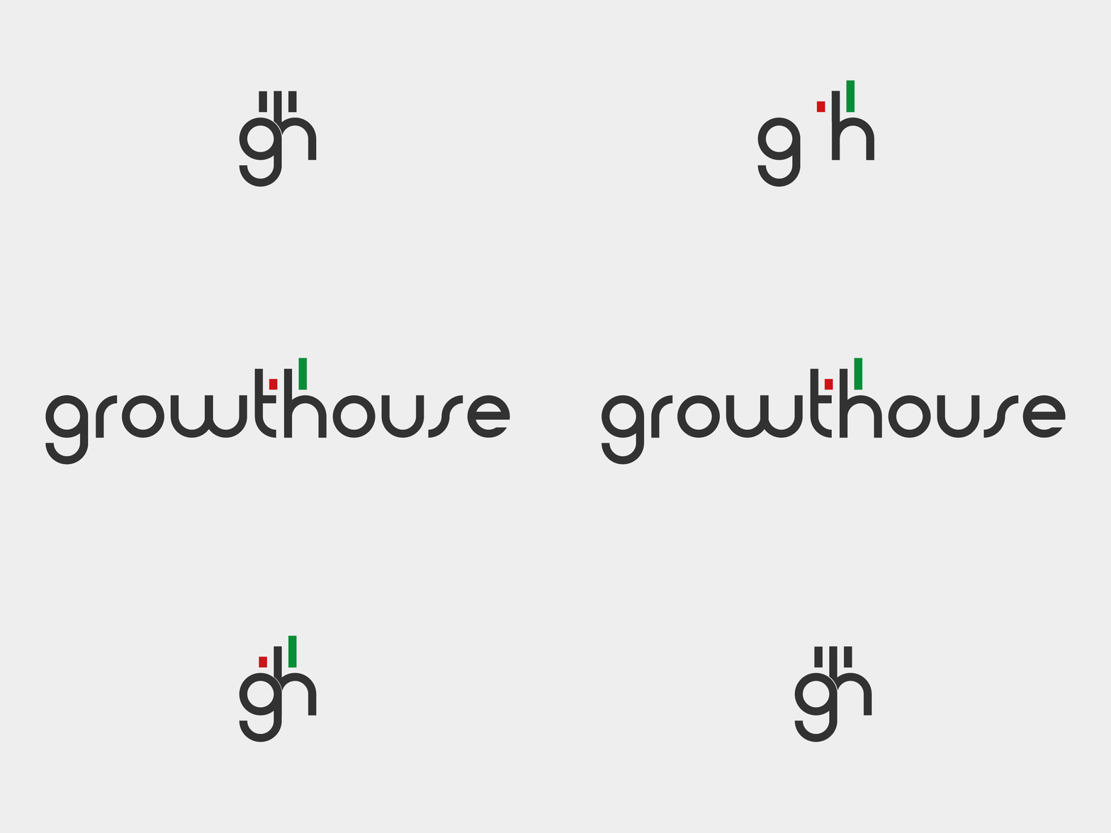
The "gh" letters in our logo are presented as a monogram, with the letters intersecting to form a cohesive whole. This intersection represents the sense of unity and partnership that we bring to our relationships with clients. We see our cooperation as a true partnership, working together towards the shared goal of growth.
Our logo features two vibrant colors: red and green. Green symbolizes stability, competence, experience, network, growth, and refresh - qualities we strive to embody in our brand identity. Red, on the other hand, connotes strength, passion, energy, and confidence - attributes that align with our approach to helping clients succeed.
The bar graph in our logo illustrates the increasing performance and success that our clients achieve through our services. The graph features three bars, each representing a stage of progress. The first bar in red representing the initial poor situation of the client and the last bar in green representing the improved standing of the client upon completing our partnership. Our slogan, "rank better grow faster," further reinforces our focus on helping businesses achieve online growth and success.
Overall, our logo is a visual representation of our dedication to helping our clients grow and succeed online. Our slogan, "rank better grow faster," further reinforces this message and underscores our commitment to providing top quality SEO services to help businesses thrive.


