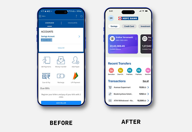
Redesign HDFC Bank Mobile App
Problem Statement
The app landing page primarily focused on Electric/Mobile/DTH bills instead of providing a holistic view of financial health and balances. Additionally, the app lacks clear visual hierarchy for elements like balances and payment recipients.
The essential tasks such as managing finances are buried deep within the menu, causing confusion among users.
Objective & Goals
Ensure the app is user-friendly with intuitive navigation.
Establish a clear visual hierarchy based on customer priorities.
Enable easy management of finances, including checking transactions, accessing fixed deposits, transferring money, and paying credit card bills.
Product User Challenges
Accessing basic account details, such as credit card transactions, requires users to navigate deep within the app.
The app lacks an easily accessible feature for what users mostly use, such as an overall view of their finances.
Account details requires multiple clicks, also missing visual hierarchy of the transactions.
Navigation is confusing.
Proposed Solution
View Prototype
With the problem statement in mind, the homepage has been redesigned more user-centric to display account balances alongside recent transactions and transfers that users have performed recently, focusing on the actions that users perform the most.
Accounts Overview
Summary of all accounts to help them to see how much money they have versus how much they owe, giving the user a good idea of their overall financial health.
We've also included a brief summary of their other products like credit cards, investments, and fixed deposits.
Information Architecture
Navigation - Created a simpler navigation system compared to the existing complex app, which requires users to memorize menu locations, this reduces the cognitive load.
Micro Interactions
Branding + Consistency
We've maintained consistency in the branding of the app by using the same color derived from the bank's logo for primary buttons and bottom menu. This approach helps users feel more connected to the bank's branding and secure.


