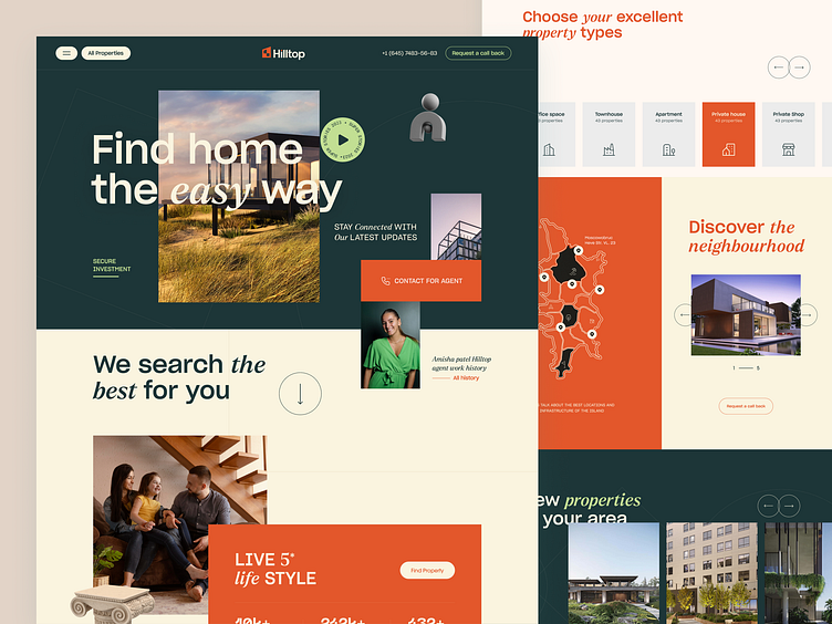
Real Estate Landing Page Design
Real estate customers are big fish
don’t bother them with clutter.
You need a good first impression if you want
a higher dwell time on your website.
But when your site is cluttered and messy
it won’t attract your visitors to stay longer.
If your visitors don’t continue to be there,
you can’t expect them to make a purchase.
So, you need to give them an engaging experience
where they will feel comfortable to spend time.
To ensure this, we designed a concept real estate website.
Here's why it’ll engage your visitors to stick around:
→ Clean and clear interface
→ Resonating colors
→ Easy navigation
→ Readable fonts
See the full case study here👉 Hilltop | Real Estate Branding, Website Design Project
Want to make your website engaging?
Book a 30-minute free consultation call with our web design wizards↙️
☎️ 👉🏼 Calendly.com
Animated Version
Full Preview🚀
We appreciate your interest, Dribbblers! 😍
Schedule a call at ☎️ 👉🏼 Calendly.com
Let's talk about your project..
✉️ hello@musemind.agency
Website 🌐 musemind.agency
Explore Our Design Case Study Featuring ➡️ Behance
Let's Check Our Others Dribbble Profile
musemind saas • musemind mobile • musemind branding
Follow us to see more exciting shots and insights on
Linkedin I Instagram I Twitter I Medium I Facebook I Webflow I WhatsApp

