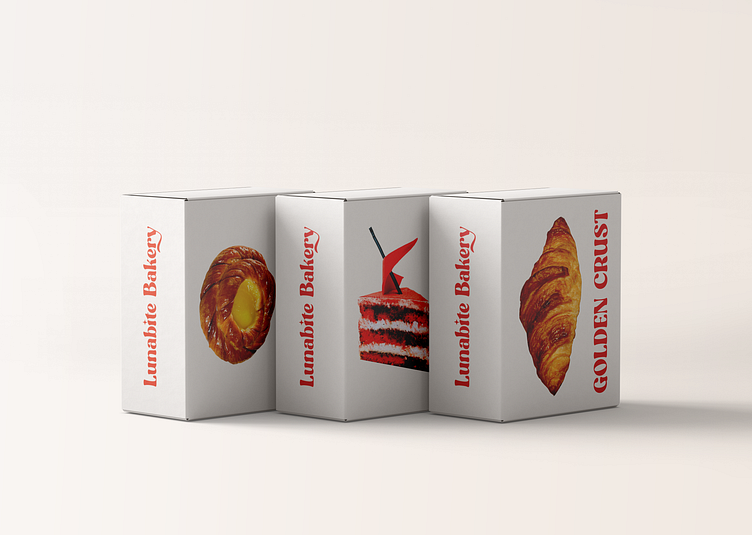
Lunabite Bakery Branding
Lunabite Bakery
Case
LunaBite Bakery, nestled in an urban neighborhood, specializes in artisanal pastries and desserts crafted with the finest ingredients. The brand exudes decadence, creativity, and whimsy, offering customers a magical escape through every delectable bite. The target audience includes dessert enthusiasts, foodies, urban professionals, and families seeking memorable treats. We're seeking a logo that balances elegance and playfulness, incorporating whimsical elements like moons or stars, soft pastel colors, and sophisticated yet playful typography to evoke a sense of sweetness and indulgence.
Solution
Our logo design incorporates the 'StereoClub' typeface, striking a balance between elegance and friendliness, which perfectly reflects LunaBite Bakery's brand persona. I've added a star on the 'I' to symbolize the bakery's magical experience. The color palette—brown for richness, orange for creativity, green for sustainability, and blue for quality—enhances our premium image and effectively communicates the core values. Overall, this design captures LunaBite Bakery's essence, showcasing the commitment to artisanal products with elegance and playfulness."
See the full project on Behance
Follow me on Instagram
Follow me on Linked-in
Thank you!!
