Kane Footwear | CRO
I love a good pair of shoes as much as the next person, especially when they are used for exercise! Kane Footwear does a good job of blending active footwear with practicality. As a value add, I decided to isolate 7 quick wins for their website. See the thread for the breakdown!
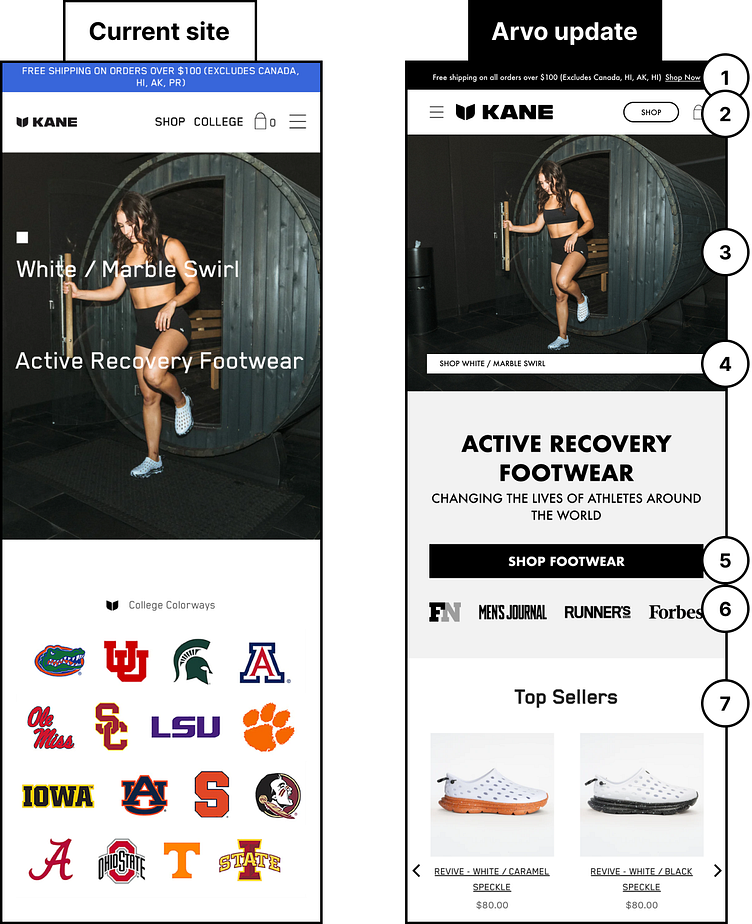
1) This is a great call-out, but try to keep the message to one line. Also, ensure that there is an action to take by adding a clickable link for the user.
2) Simplify the mobile navigation by keeping the navigation links within the hamburger menu. Pull out the most important CTA and highlight it.
3) Separate the message from the image so that both can be communicated effectively.
4) Add a secondary CTA to the hero that takes customers to the product that is featured in the image.
5) Make user engagement easy by ensuring key action buttons are full-width on mobile, and sit at the bottom of the fold.
6) Add brand logos for users to gain more trust in your product or brand!
7) Bring your products higher into the page hierarchy so that users can easily browse your products. Give them an opportunity to see the best collections without having to scroll too far down the page.