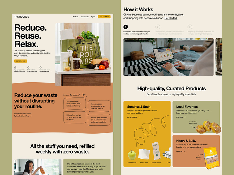
Sustainable Delivery Homepage Design
I crafted The Rounds' new homepage, showcasing their updated brand with a fresh, modern aesthetic and impactful storytelling.
The Problem
The company had grown considerably from its early-stage startup days and had many new products and services to showcase. They were also repositioning their brand to be a high-quality, sustainable lifestyle service, which wasn’t reflected in the previous homepage.
Goals
1. Bring this new brand position to life through a refined look and feel
2. Clearly explain their products and services, while explaining how it fits into the customer’s lifestyle
3. Ultimately, increase signup conversions
The Design
The homepage uses a modern, modular/bento-style grid to showcase their various products and services. The hand-drawn details keep the communal and playful nature of their brand, while clean typography and thoughtful spacing elevate the look and feel.
The Copy
Copywriting matters. Especially for conversion-focused sites. The hero provides a clear description, value props, and a CTA above the fold. It's also important to resonate with customers and show how your service can directly solve their problem. That's why I included a section that speaks directly to their common pain points.
Looking Back
Working with this team to bring this homepage to life was a great experience. I love when I’m able to amplify mission-driven companies like these folks through the power of design!
If you’re in the #sustainability space, please reach out. I’d love to work with more of you! Learn more at www.designgal.studio
