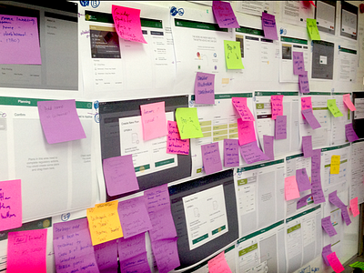
UX Artefact example #012 - UX is not always sexy
Process is more important than polished product when talking about UX Projects. It can be challenging to showcase a lot of the output from early UX stages, plus, a lot of it can be fairly boring to look at..
This piece forms part of a wireframe review wall. High fidelity wireframes were openly presented (although they could've been presented at any fidelity level for previous reviews) to act as a conversation catalyst, encourage debate and critique.
Criticism is one aspect to being a designer - of any creative discipline - you simply have to get used to as its pretty much unavoidable. However, if its presented in an unproductive manner then it will breed a defensive disposition and ill feelings amongst those connected to the design, but if its presented constructively it will, by proxy, afford an education, an evolution and ultimately, growth.
How you accept, and give, a critique is something that comes with time and experience, but essentially there are two main types of feedback: Reaction or Response.
Reaction-based feedback is just that - an immediate reaction without context "..that looks terrible!"
Direction-based feedback jumps too quickly into problem solving "..no, you should do it this way!"
But an effective response compares a design to the objectives it was attempting to meet "..what's the primary goal of this element?"
For more UX and design talk follow me http://twitter.com/harrisonUX
