Music App UI
💌 Have a mobile app idea? We are available for new projects!
hello@ronasit.com | Telegram | WhatsApp | Website
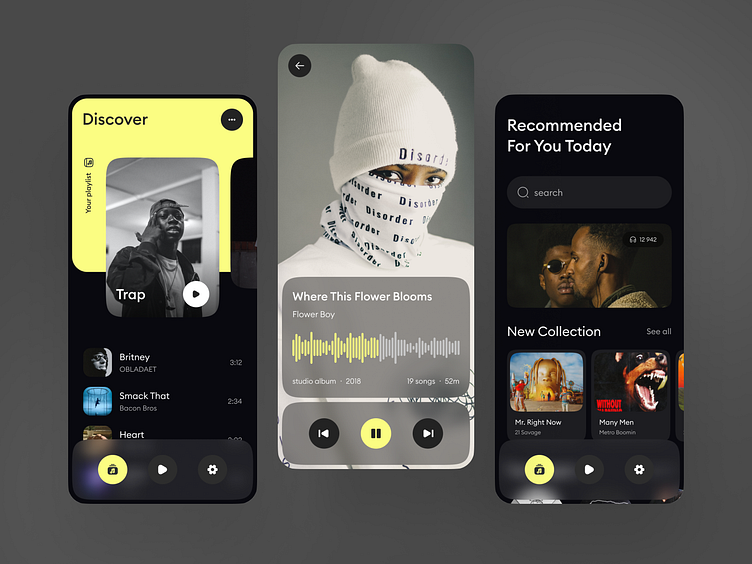
Hi all! We're excited to share our design concept for a music streaming application that offers a premium listening experience.
The app's first screen is a stylish music player interface, followed by a second screen featuring a personalized recommendations feed based on the user's listening habits. The third screen is dedicated to the user’s playlists, allowing easy access and customization.
We chose a black and grey color palette with striking yellow accents that seamlessly blend with vibrant album and song cover art, giving the app a modern and dynamic feel.
The main feature of this design is its user-friendly environment tailored for music enthusiasts. The app's intuitive layout ensures any user, regardless of their tech-savviness, can easily navigate and enjoy their favorite tracks.


