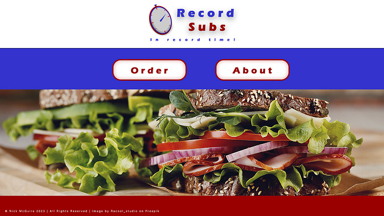
Designs for Record Subs
Overview
This was a landing page mockup for a concept university sub shop I created using Adobe Photoshop. I was tasked with designing the page for a class in UX/UI design. The colors are reminiscent of the school colors for the college I was attending.
Personas
The following personas were created to guide the design process throughout. Since I was designing the page for a university sub shop, I chose to create two profiles, one for a student and another for a professor.
Lori Sandoval
Student
20 years old
Majoring in Psychology
Hobbies include playing guitar, hammocking, reading ghost stories
Taking 15 credit hours this semester in psychological profiling, abnormal psychology, and applied psychology
Hopes to graduate in two more years and become a counselor for a major hospital
Single, but active in the campus social scene
Favorite sandwich is a tuna melt
Cory MacDuff
Professor
53 years old
Teaches Ancient History
Hobbies include writing short stories, fishing, kayaking, and disc golf
Teaches four classes a day, including two core education classes
Desires to stay at the school until retirement at age 65, then move to Wyoming and live in the mountains
Married with three children, all in their teens
Favorite sandwich is a reuben
Color Scheme
The color scheme was chosen to approximate the colors of the college with some variations to allow for greater ease of use.
Reds
The reds vary from solid bright red to a lighter shade of red to maroon for various button states, headings, etc. Reds will be used to express energy and passion as a signal for quick service, to whet the appetite, and to call the user’s attention to important actions.
Blues
The blues also vary from solid royal blue to other shades and hues to account for different visual hierarchies within the website. Blues will be used to increase brand trust and loyalty, to create a stable environment, and to allow the user to have a comfortable and pleasant experience.
Name
"Record Subs" indicates both that the shop wishes to be the fastest shop and the best shop for sub sandwiches on campus.
Wireframe
The following wireframe presents a simple design for the sub shop website. To increase speed and efficiency, the landing page includes only two CTA buttons, "Order" and "About". The goal is to allow customers to order quickly, but also be able to learn more about the shop if they are interested to build brand loyalty. Clicking the about button on the home screen takes the customer to a timeline listing the history of the shop to build brand recognition and promote feelings of reliability and trust in the customer. From the order button, customers are taken to an order screen where they select what items they want and see the total added up in the side bar to the right. Once they have selected all their items, they click the checkout button to input card information and pay, completing the order. The entire interaction is designed to be as quick and efficient as possible for the customer.


