Cercanías WebApp

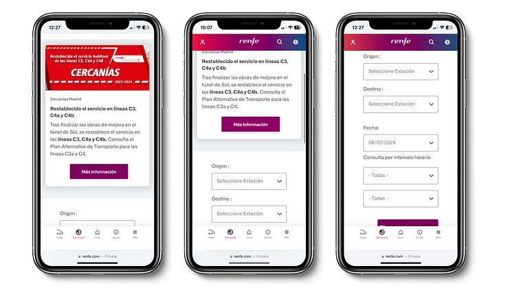
Old design for path finder.
News information occupies a large part of the screen and its main function (train route search) is not displayed.
Search contenders are not justified with consistent distances, the main button is lost in user visibility and lack of consistency.
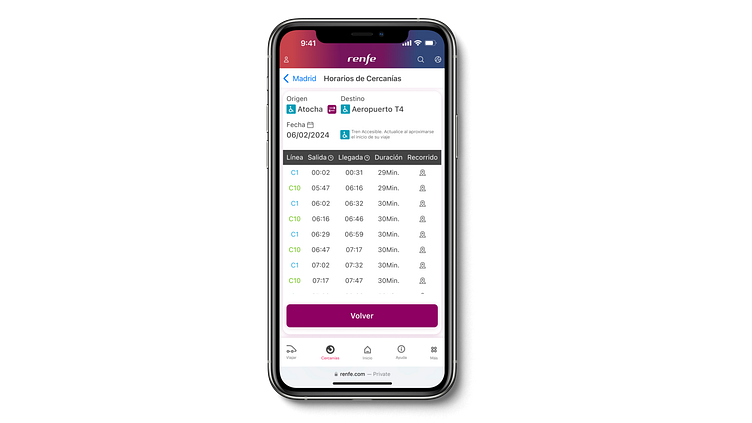
Old route information
It is not intuitively visualized that you have the possibility to invert the origin and destination.
The information of the trains is shown in a very unclear way, it does not have a fixed header so that the user does not know which column it is and its meaning.
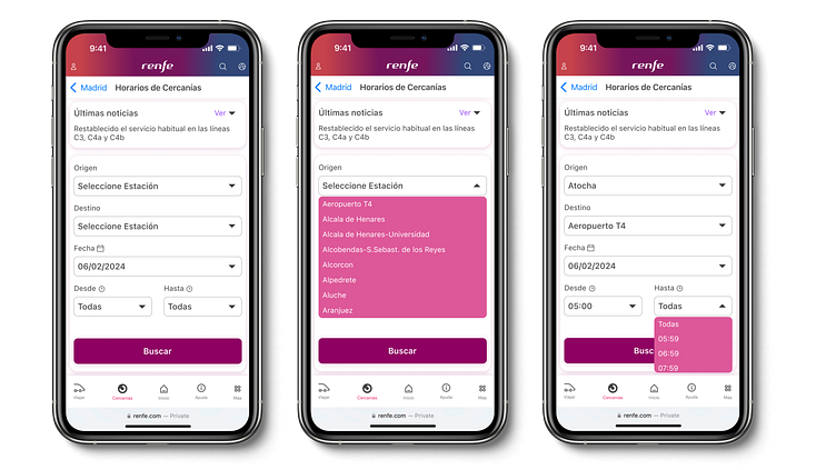
New design for path finder.
We can see that all the necessary information is always visible, and that the main button has coherence and consistency.
Also the news information related to commuter news is a drop-down, although important data will always be observed.
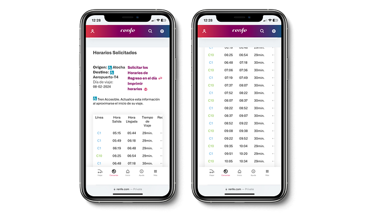
New Design Route information
The route information is clearer, it is easy to reverse the origin and destination.
The train information will always have a fixed header while the train data is in a scroll-bar, so the user always knows what each column consists of.