Branding Case Study: Harmos - Clothing Rental Subscription

Research
The target consists of white-collar women living in urban and suburban areas of US who love quality fashion and strive to look polished and stylish at work and in their social lives. After conducting a deep research, I noticed that the target encounters several problems in the styling journey like time-consuming selection and creation of daily outfits, dealing with dress codes, the will to change clothes frequently, and the difficulty of finding a service that satisfies these needs.
Strategy keystone
After exploring different territories, I chose the “harmony” concept, believing it is perfect for a company that aims to simplify and enhance customer styling process and overall well-being. The idea is that when there is harmony between the brand and the customer, desired and actual appearance, and the world, women can express themselves at their best and find happiness and inspiration.I created a brief story called “Brand DNA” that includes purpose, mission, vision and values.
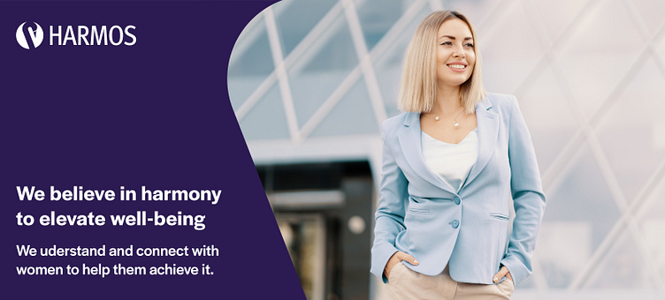
“Professional women with a strong sense of style and a love for quality fashion, desire to always look their best, but often have to deal with challenges like time and dress codes. We found the solution: Harmony, we believe is the key to elevating well-being. Understanding and connecting with women to help them achieve it, we imagine a world where women, powered by harmony, can improve their lives.”
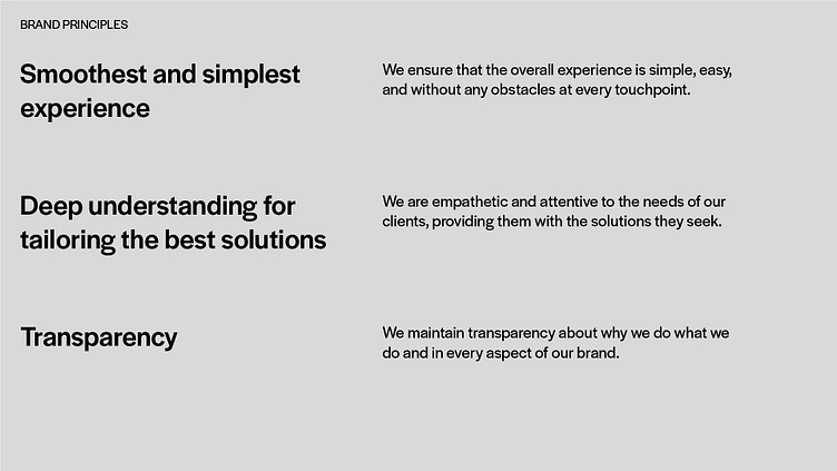
Brand principles
were created to ensure that the brand maintains its DNA in every situation.
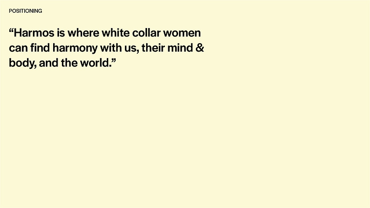
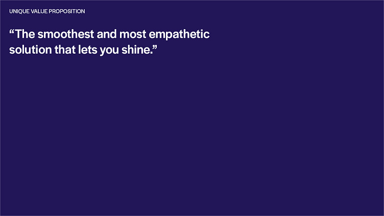
Positioning the brand
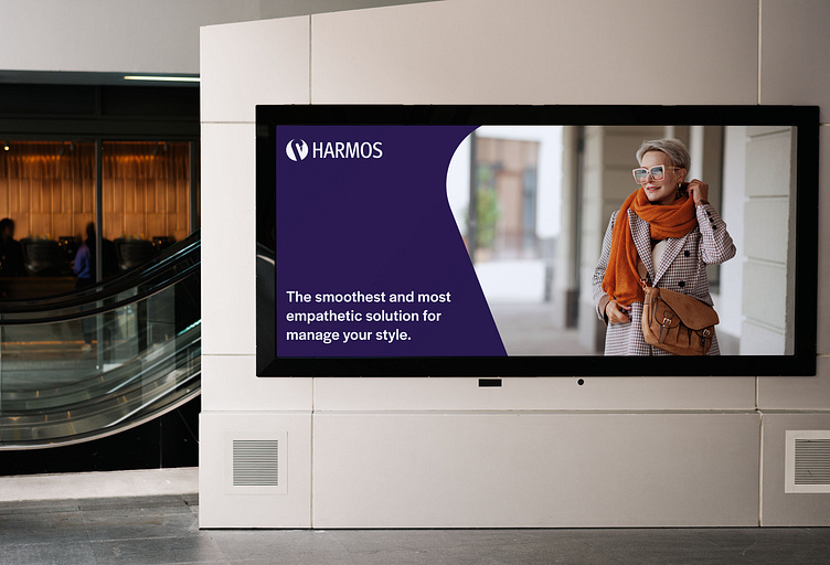
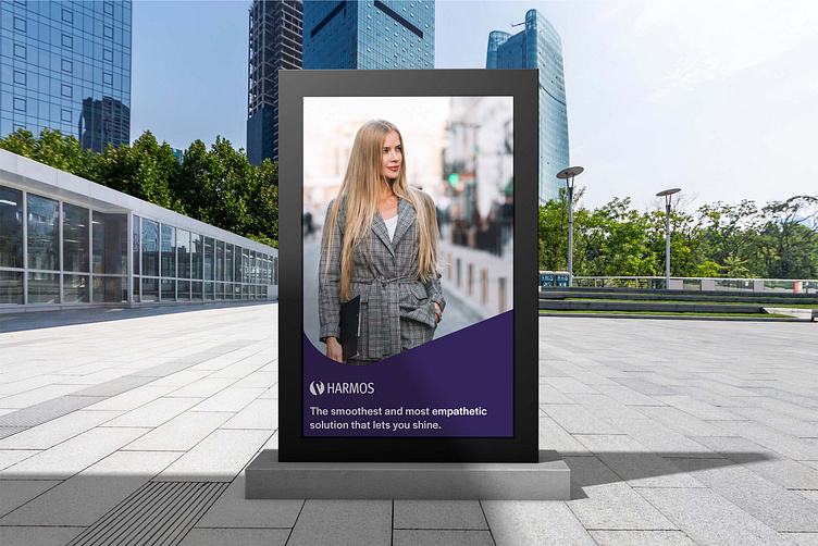
While competitors focus on the convenience and the vast selection of clothes available, I positioned the brand as a stylish partner that helps the target to reach the harmony and developed a Value Proposition that gives to the target what it needs.
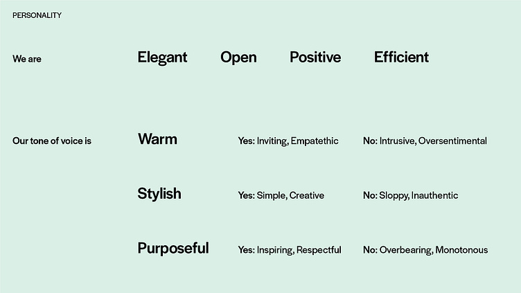
The brand humanized
I gave Harmos a personality and tone of voice consistent with the brand, characterizing it in a unique way.
Naming
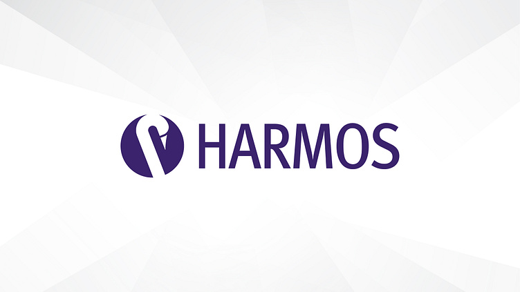
Following the strategy, I chose a simple but strong and unique abbreviation of harmony: “Harmos”. I ensured that the name is easy to read, pronounce, and has no negative meaning in any language. A trademark audit confirmed its suitability for trademarking in all countries worldwide. While the brand was born for the US market, the name doesn’t limit potential future expansion.
Visual identity
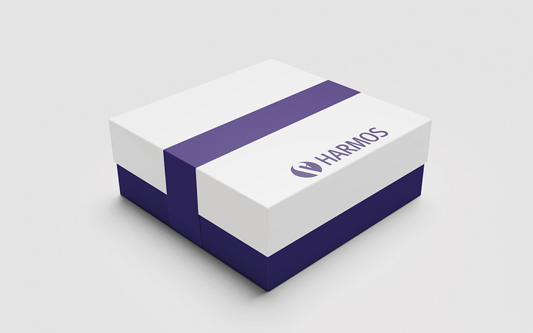
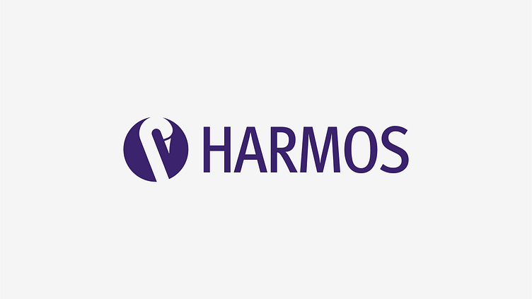
I explored different ideas for the logo, following the route of harmony and the ‘negative swan’ was chosen: three shapes that in a certain position show a negative figure of the head and neck of a swan. I believe it represents perfectly the brand because only when there is harmony between all the shapes, the swan emerges. The shapes represent the environment and the relationship of the target with it, and the swan represents the target when it can feel and express itself at the best.Additionally, the logo is simple and evokes an emotional reaction from the target.
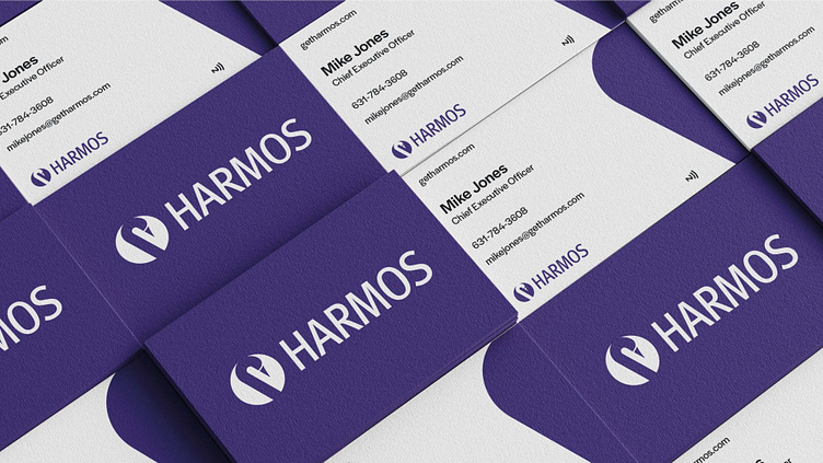
I completed the visual identity by developing a color palette made up of Violet, Green, Red, and Yellow, a typographic system based on Halyard Display by Darden Studio, and a graphic system based on the line shape of the swan.
Results
I have given Harmos a unique and strong position and identity that satisfy the needs of the target and set it apart from competitors.