Phoenix Landing page
Phoenix — Comprehensive analytics
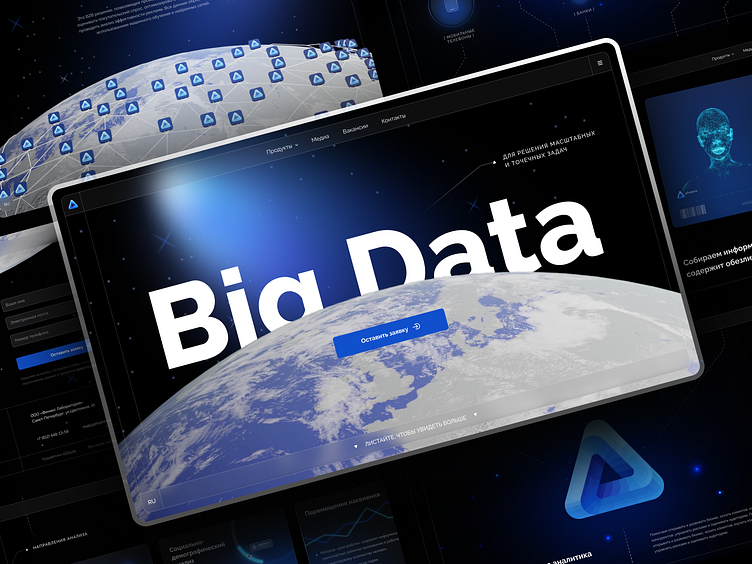
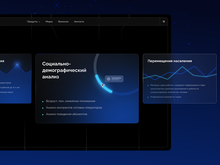
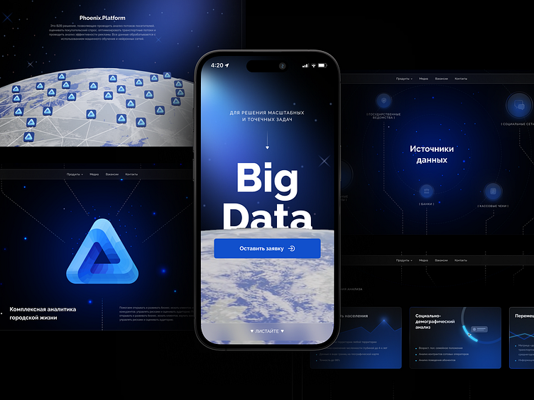
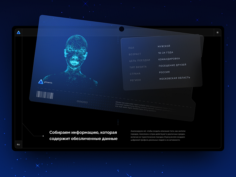
The main UI pattern is 3D layers, volume and glows: shadows set accents and add depth, and the product is always shown in the context of the use case.
We developed a design that meets both the redesign objectives and the expectations of the target audience: we used the geometry of the logo, interface shapes, colors and patterns from the brand book.
The work was done as part of a studio job Pixpowder
Art-direction by Marie Melnikova
