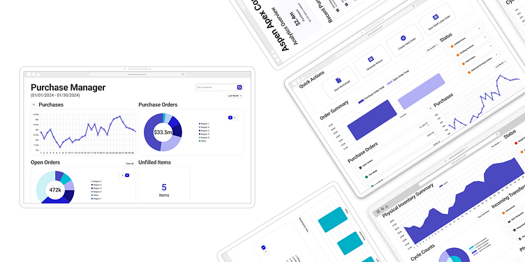
New Year, New SureCost!
SureCost is a purchasing solution for pharmacies. With over a decade of experience in purchasing, savings, and compliance the HealthTech company is ready to step into its next era -- yes, that was a Taylor Swift reference 💫.
-------------
Outdated UI & Not Easy to Use
When I joined the team, the UI was complicated, not easy to understand, and not very fun to use. Before work on a solution could begin, I established a baseline of what the company was trying to accomplish. The goal was more sales/marketability while making the platform easier to use.
The Solution
An easy-to-use, clear, and modern interface. Analytics you can interact with, purchase orders at a glance, and a chart to track total spending. I was asked to not change any of the data or functionality, but only re-present the information on the screen.
Purchasing, but easier.
Asking the question, "what is this user trying to accomplish?" helped guide each page. At the corporation level, users will want to see analytics, data, and keep track of important spending.
As the user doing the daily tasks, I'm going to need access to my most used tasks and keep track of spending within my department. I also need to know when something goes wrong so I can quickly address it.
Keeping Your Inventory Stocked
A snapshot of your inventory and toggles to see comparative insights to your charts help users with one click gain a different perspective on important inventory topics.
Helping users keep a pulse on their daily tasks and important to-dos by elevating those tasks and raising the current status of those tasks.
Next Steps
Our hope in the next iteration is to ask what does the future of a modern platform look like? What are people doing now that they weren't 10 years ago and how can we surface those tasks in an impactful and easy-to-use way?


