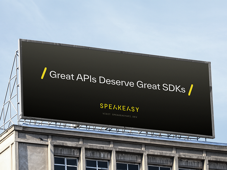
Speakeasy Visual Identity
Speakeasy is accelerating innovation by making it easy for developers to create or consume any API. APIs facilitate communication between two software components, which is often the initial stage for development.
With their previous visual identity, Speakeasy was limited. There were inconsistencies between their tone and visuals, and the brand was built on a bright and playful color palette that didn't really match who they are and what they offer. Brand elements were well-designed, but they lacked strategy, or at least a consistent conceptual narrative.
The Single Most Important Thing (aka SMIT) for this rebrand was to convey “Crafted by Design.” Speakeasy pushes the boundary of what people thought was possible for machine-generated code, and their technology produces code that has real craftsmanship behind it, and quickly.
It was a pleasure working alongside the Speakeasy team to differentiate their brand from the rest of the crowd.
Click here to dive in to the full case study.
---
Looking for a brand agency? We would love to hear from you.
Email us: hello@odibrand.agency
Our Website / Instagram / LinkedIn / Twitter
