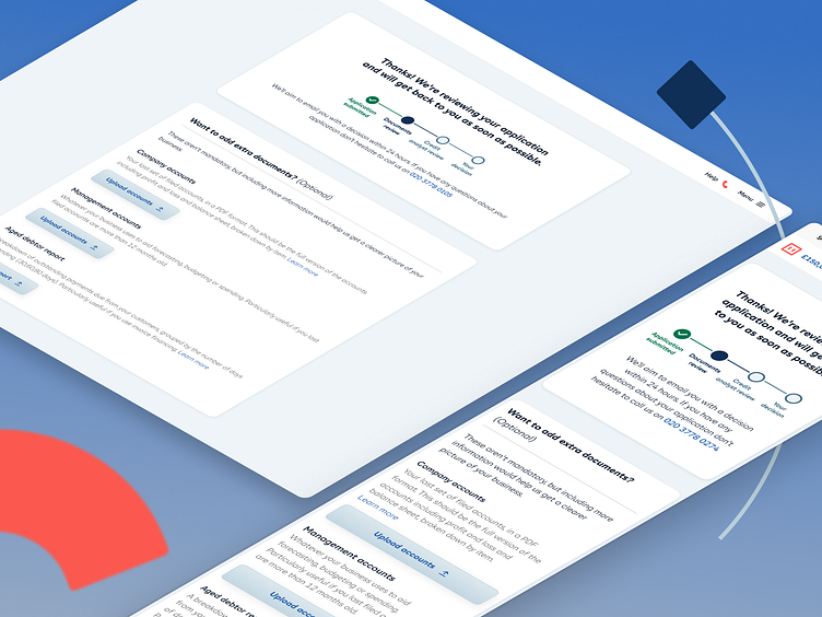
Business finance application - review screen
Originally, once a customer had completed their application with us, we displayed a very simple screen which only just told customers we would be in contact shortly.
Now we have added in a progress indicator to provide them with more information about the next steps in their application. We have also moved the optional documents section (originally on our trading history page) onto this page as it reduced the cognitive load a user would experience during the final highest friction point in the journey.
Drop us a 'L' if you like it!
More by iwoca View profile
Like
