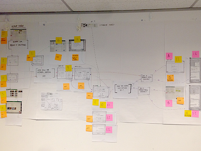
UX Artefact example #008 - UX is not always sexy
Process is more important than polished product when talking about UX Projects. It can be challenging to showcase a lot of the output from early UX stages, plus, a lot of it can be fairly boring to look at..
This piece forms part of the process of System Mapping. In order to visualise how one section of a system (or site) inter-connects, we have to 'map' together all the known pieces of the 'system'. The unknown pieces we filled with sketches, post-it notes and questions. Lots of questions.
This piece will eventually evolve into a System Map diagram (or Sitemap if its a website), which will then be water-tested against use cases, user stories, customer journeys, scenarios, etc. It can also become the back-bone for user testing certain scenarios; in turn allowing for prototypes to be created and tested with users.
The advantage of working this way allows everyone (design, development teams and even clients) to easily see and walk the system at a high level. This is done to facilitate discussions and questioning, and allow deeper diving into the details and expectations around the proposed design - this includes aspects such as the user flow and goals, the overall process flow and to highlight any potential blockers, bad paths or hurdles.
For background purposes, we had at this point already generated the Personas and Scenarios - which we could then use to walk through as a users - along with some early, conceptual wireframes, hence why I proposed and carried out this activity.
For more UX and design talk follow me http://twitter.com/harrisonUX
