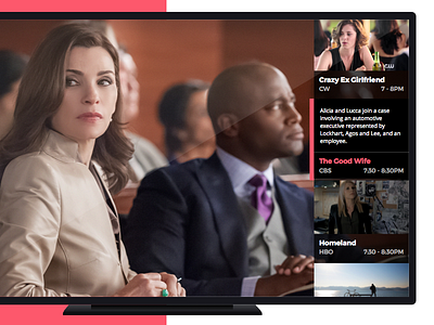
Smart TV UI
Problem: When user switches channels, most TVs use a horizontal slide-out which covers half of the screen, making it hard to see the current program.
Solution: There's more real estate horizontally on a TV screen, a vertical slide-out would be less disruptive. What's more, TVs remote's channel switching buttons are up and down, not left and right, which makes this UI a lot more intuitive.
More by Yi Ren View profile
Like
