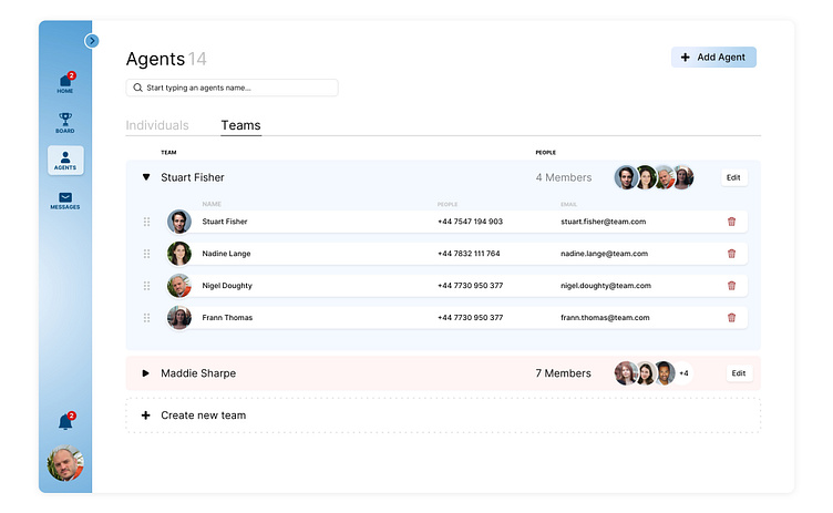
Team Dashboard
Designing dashboards for varying sized teams can be complex because of the data volume differences between small to large companies. I took a current dashboard with very little design and created a dashboard concept for team management.
To begin with, I wanted to create a clean layout with white colour as primary and splashes of bright colours as accents. This solution helps the user to access specific info at initial glance. The sidebar provides space for navigating the main areas of data.
Let's collaborate!
nigeldoughtydesign@gmail.com
More by Nigel Doughty View profile
Like


