BoAt App UI Design

Hi Folks,
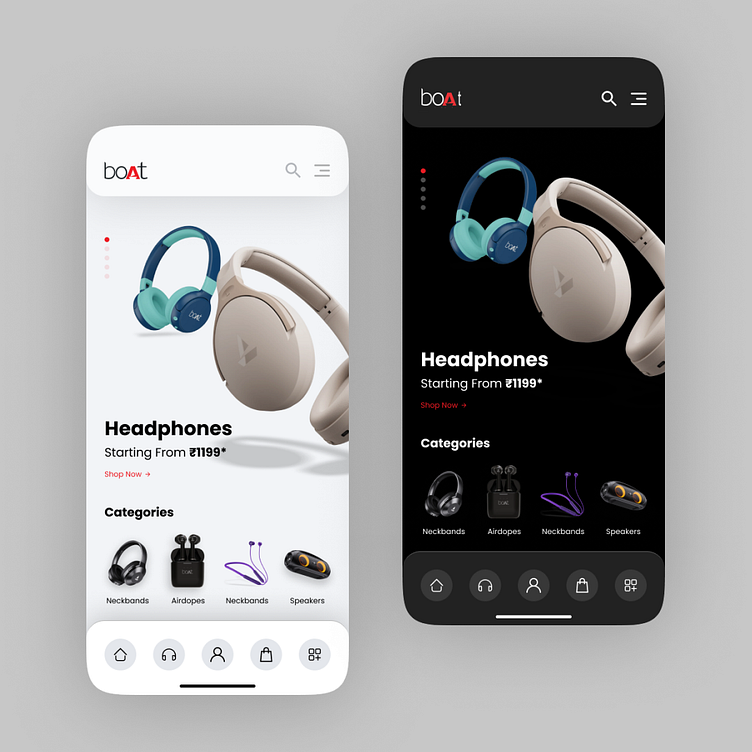
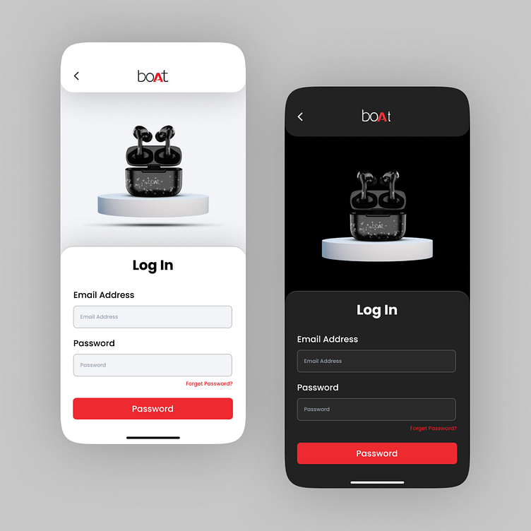
🎧 BoAt App UI Design- Light vs. Dark Theme 🌓
Excited to share my latest design exploration for a BoAt app! 👩💻🎨
🌟 Light Theme: Bringing a fresh and vibrant feel to the user experience, the light theme of the headphone app is designed to be visually inviting. The clean interface enhances user interaction, ensuring a seamless and enjoyable journey through the app.
🌑 Dark Theme: For those who prefer a sleek and modern look, the dark theme provides a sophisticated touch. The contrast not only adds a touch of elegance but also contributes to reduced eye strain, creating an immersive experience for users, especially in low-light environments.
🤔 Why the Duality? Understanding user preferences is key to creating a versatile app. Offering both light and dark themes caters to a diverse audience, allowing users to tailor their experience to their liking.
🚀 Key Features:
Intuitive navigation
Dynamic color schemes
User-friendly interface
🙌 Grateful for Feedback: Excited to hear your thoughts on this design! Whether you're a UX enthusiast or a fellow designer, your feedback is invaluable. Let's spark a conversation about design trends and user experience. Also available for new projects. 🚀
#UIUXDesign #AppDesign #HeadphoneApp #DesignThinking #UserExperience #DarkMode #LightMode #DesignFeedback
