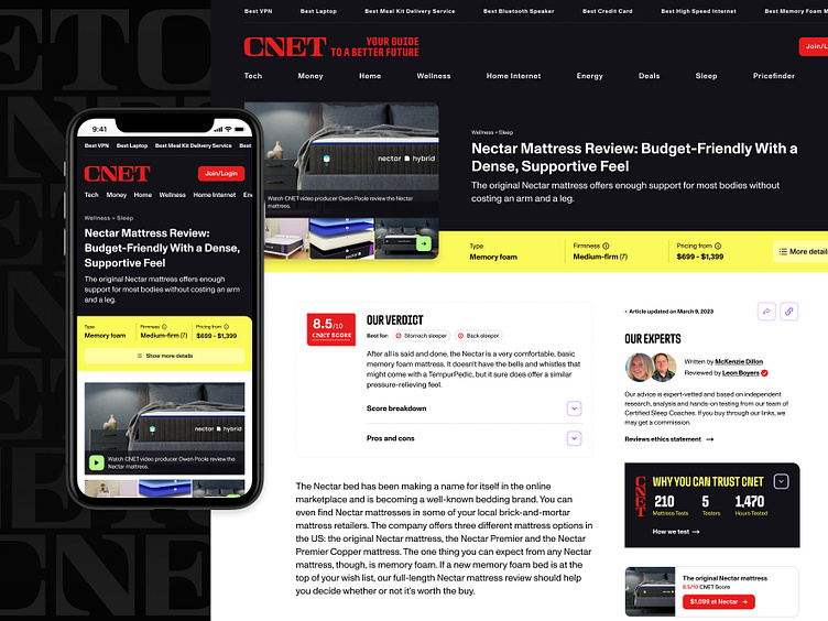
CNET Mattress Review Template
Problem: Reviews performance has been down from an SEO and a revenue perspective.
Task: Redesign sleep’s single product reviews template to include more opportunities for users to convert, include new Neon styles, and work with SEO to increase rankings.
Solution: The current template is just wall of text and is not easy to scan or find the information necessary to make a decision. In order to fix this I created new components that converts important content from paragraphs to a list format that contains graphics and headings so that users can scan the content faster.
To increase the SEO rankings I performed market research to find areas of opportunity for us such as gaps in content and combined that with user research which showed we needed to reorder our content on the page to put the most important topics at the top of the page.
Design Process
Market research, user research, then present findings
After performing my research I put together a quick design using the current design styles and presented my areas of opportunity and considerations to the team. I also highlighted which team(s) the note applied to so that they could weigh in and we could decide on next steps for the final design.
Final designs
Make the content easily digestible
Users should be able to scan the page and quickly find the information needed to make a purchase decision.
Alternate Hero
We should always be testing in order to optimize the user experience and ultimately increase revenue for the business.
Tooltips & Modals
We are adding tooltips to show a more extensive view about the most important product details, and add a level of transparency where needed.
Desktop
Mobile


