Verona UI Components
Welcome back to the empowering universe of Verona!
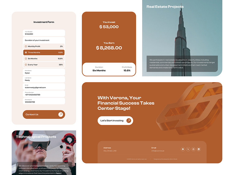
Discover a quick overview of Verona’s UI components. We introduced an informative investment form with simple entry requirements.
The interest rate is automatically computed based on the user’s input. To achieve Verona’s intuitive interface, we've maintained a clear design hierarchy, guiding users toward investment decisions.
To do this, we kept project descriptions succinct, avoiding information overload, and incorporated illustratively matching visuals. Colors white and russet were utilized, in contrast to the background color, for CTA buttons to add prominence and enhance visibility.
Have any inquiries? Send us an email at hi@abron.co
More by Abron Studio View profile
Like
