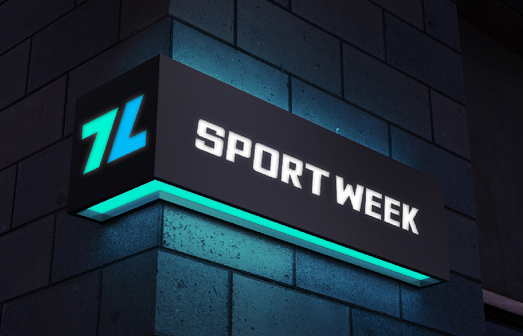
GYM logo and identity
I am pleased to introduce the new logo for the sports club, which perfectly embodies its values and characteristics. At the core of the design lies the symbolism of cyclicality and continuous development, depicted in the form of an eight where one part is presented in its regular position, while the other is mirrored and inverted. This concept underscores the importance of nurturing one's health and physical fitness each day, serving as a reminder of the consistency of efforts. In the logo, we have employed neon blue and turquoise colors to accentuate its modernity and freshness. Blue signifies energy and dynamism, while turquoise evokes a sense of calmness and relaxation, making it ideal for a sports club. The use of simple shapes and a bold sans-serif font conveys confidence and reliability, qualities that define our sports club. We are confident that the logo will serve as an effective identifier for the sports club, capturing the attention of clients and accentuating its prestige and professionalism.


