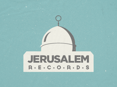
Jerusalem Records Logo Suggestion # 2
Alright. So the client wanted me to take a non-political and non-religious approach to the design. Which I agree is a smart choice.
The old JR logo had some reference to the spire on top of the tower at the Stockholm City Hall, so I was given the green light to run with that and evolve the idea.
This is the result. I'm pretty satisfied. I have wanted to try out the "Mensch" typeface by (the very talented) Morgan Allan Knutson for a while and I think it worked well here. The type is available via Lost Type Co-op.
Anyway, I'm very eager to hear your opinion and any type of feedback is welcome as usual! :)
More by Emir Ayouni View profile
Like

