Way-finding Map for the Natural History Museum of Utah
Designing A Sensory Led Way-Finding Experience For Kids.
The Natural History Museum of Utah and the University of Utah's School of Design organized a design contest to create a way-finding guide for their school programs department. As the contest's first-place winner, I was awarded a three-month apprenticeship and the long-term adoption of my work
Outcome
An eco-friendly map for ongoing school use, made from sustainable materials and a light matte coating for durability. Accompanied by badges to distinguish school groups from regular visitors.
Simplifying Spatial Complexities
NHMU is known for its award-winning architectural avant-garde design. Spatially, the naturally leading paths and floor ascensions are immaculate. But trying to visually navigate and understand the structure of the museum in 2D is challenge. This is imperative for chaperones and visitors with special needs. So I focused on refining a map that would solve just that.
Highlighting Sensory Experiences
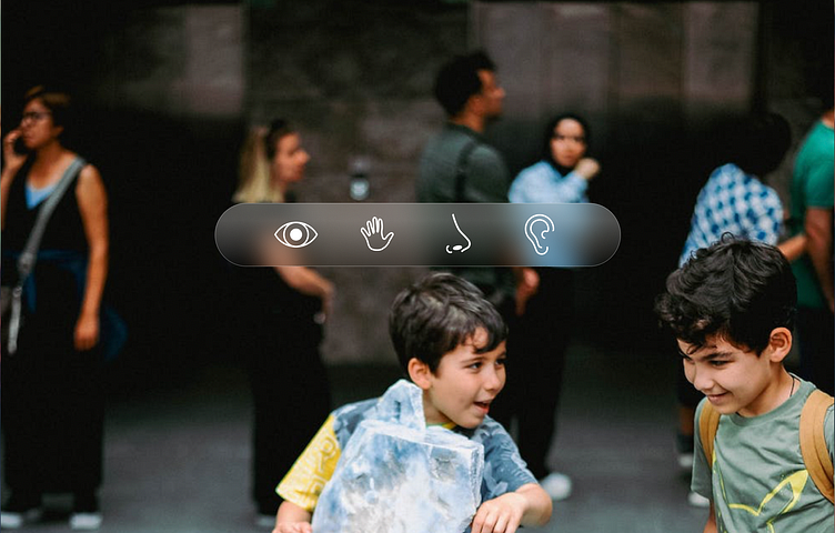
NHMU’s schools department worked hard to ensure that the students visit aligned with in-school curricula. Meaning that prior to visitation students had previously learned about Utah’s geography and Native American History. Naturally this led my focus to ensure the way-finding map to center around crucial visual, tactile, auditory and nasal led interactions.
Working with Visual Parameters
Given that the final product was intended for customer facing experiences, it needed to look and feel like an extension of the existing museum brand guidelines. I focused matching predominant colors according to the museums exhibits and distilled a core color palette.
Design Mentor: Dawn Farkas-Prasad, Sr. Exhibit Designer at The Natural History Museum of Utah


