Global Medical Trade | Branding & Website
When it comes to medical equipment, every detail must be carefully calculated. This is exactly what we tried to achieve when working with GMT, a medical equipment trading company. For them, we developed a unique visual identity and revamped their online store for the best customer experience.
The logo, made up of the company name in a classy font and two nice, friendly-looking ellipses, helped build a visual bridge between medical technologies and customer trust. Complete with the lowercase letters and brand colors, this logo is a perfect embodiment of the brand concept, communicating proximity to customers.
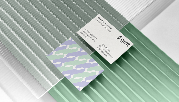
The signature pattern on business cards is more than just a stylish touch—it is actually part of a color-coding scheme where every department is assigned its special color. Emerald stands for Accounting, lilac for Marketing, while the CEO’s business card has several colors harmonizing together—a visual metaphor for his active involvement in all the domains.
The home page of the GMT online store is the heart of the brand’s online presence, where the client and the company meet for the first time, setting the tone for their collaboration. Therefore, when implementing the new visual identity, we were tasked with improving its usability and aligning it with the company’s values and possibilities. Similarly, the product page plays a crucial role in the buying process, serving as an informative showcase of the product's features and advantages to aid potential buyers in making well-considered decisions.
Our complex efforts have yielded a modern and recognizable visual identity for GMT. We have optimized the website for more convenient and informative customer interaction. We have also improved its structure and navigation, thus greatly enhancing user experience.


