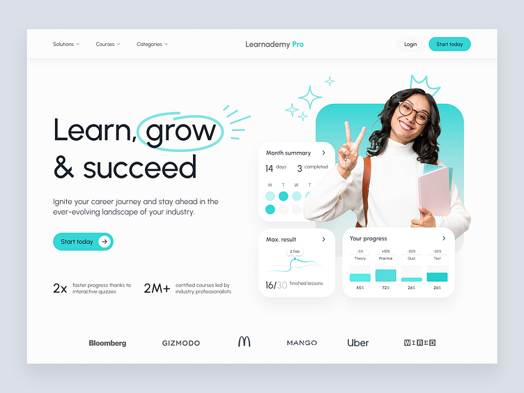
E-learning - Landing page
Hello everyone 👋
I'm returning to regular posting and am quite happy about my new routine. 😊Today I'm sharing a hero section for the landing page of an educational platform.
This time I tried with just one color dominant. Traditional blue was a little bit boring, so it's a more subtle pastel shade. It's pretty clean and simple - it was quite quick to get it done.
Let me know your thoughts :) And as always - your feedback is appreciated! 👩💻👨💻
More by Patrycja Kur View profile
Like
