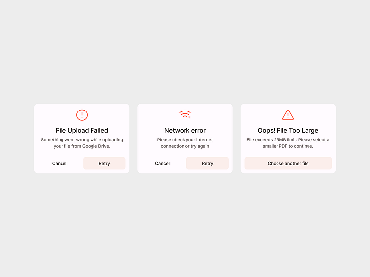
File upload different error states dialogue box with CTA
Whether it's a file too large, an unsupported format, or a network hiccup – this dialogue box not only communicates the issue but also guides users on the next steps with a clear call-to-action.
I began this design journey by anticipating user frustrations and transforming them into opportunities for smooth navigation. Each error state is an invitation to try again, providing a user-friendly experience even in the face of setbacks.
More by Sarib Khan View profile
Like
