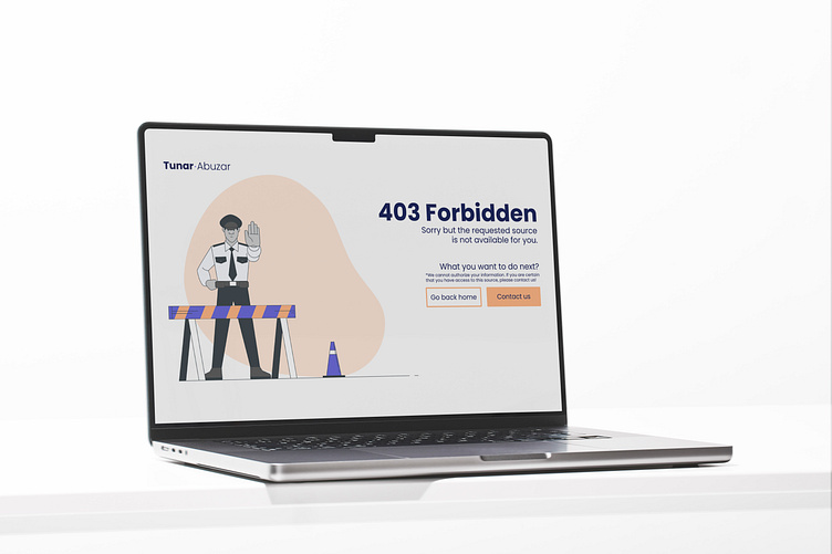
403 Forbidden Error page design
The 403 forbidden page is a standard error that comes from an HTTP server like a 404 error. If we say it more simply, the server recognizes the user but denies granting access to the requested source.
This page design is also one of the essentials of the website. Assigning a design to this error code will allow you to transform this error into an experience.
To understand better and create better experiences keep below listed items below in mind while designing the 403 Forbidden Page.
1. The code itself.
This is standard an HTTP Server error code and it is part of the HTTP/1.1 protocol.
2. The reasons for the error 403.
There are a couple of the reasons for server to reply with this error. Such as IP mismatch, authentication failure and insufficient data. In these cases server recognizes the user but lacks valid data it returns an error.
3. Authentication or Authorization:
The difference between a 401 Unauthorized and a 403 Forbidden is obvious. While a 401 suggests that the user needs to provide valid credentials, a 403 indicates that the server understands the credentials but denies granting access due to not valid permissions.
4. Experience
As in our previous post and discussed error or success page designs, we need to consider the experience of our users and make them not struggle but have a good experience through these codes. that is why it is very important to understand the reason for the error and create an appropriate design for users to understand why they see that screen.
To summarise everything we talked about in an easy way, the code 403 Forbidden is a standard code from an HTTP Server, this code says I know who is requesting the access but I do not have enough info to grant you access.
