JOHZEEF: Indie NeoBrutalist Design
Staging a Scene for an Indie Artist
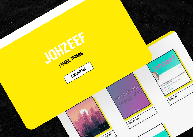
As a designer who values bold self-expression, I was inspired to craft a striking digital home for musician Johzeef that matched his daring spirit. His indie works exude raw creativity, a quality I aimed to highlight through a minimal yet impactful design.
Defying Convention
The process began by selecting a vibrant yellow as the hero color - a choice meant to command attention amid muted tones. This bright flare represented Johzeef's music, which stands out as a beacon of originality in the dimly lit world of indie.
I paired the yellow with a pared-back neobrutalist aesthetic to establish an unrefined yet energetic vibe. Chunky sans serif fonts in high contrast pay homage to indie's DIY roots while signaling its digital future.
Each typographic and chromatic decision was carefully considered to set the stage for Johzeef's auditory productions. The visual language works in harmony, like instruments in a composition, to immerse audiences in his artistic world.
Form and Function United
Usability was just as crucial an element as daring aesthetics. Intuitive horizontal navigation flows naturally, guiding fans and newcomers seamlessly between destinations.
The dynamic "Projects" feed offers a real-time window into Johzeef's creative process, encapsulating indie's unpredictable nature. It promises an front-row perspective on his journey of musical self-discovery.
The redesigned site stands proudly as a beacon for unconventional talent and proof that rules are meant to be challenged, not obeyed.
Dialogue with me on X: @benajaero
Check out the site: https://johzeef.netlify.app.
View our agency site: https://www.coxcode.io/portfolio
Together, we're crafting experiences that resonate far beyond pixels on a page.


