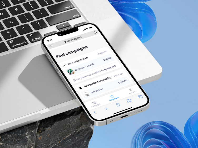
Krispy. Page with Campaigns
Hello there, Dribbblers 🙌🏻
Today, let's dive into the breakdown of the campaign search screen and explore its interesting features.
The screen is divided into two zones. The first zone consists of the list of available campaigns and the navigation. Let's start with the list. The list is a collection of cards displaying campaign information. The first noticeable element is the campaign title next to the company logo. To the left of the title is the publication date, allowing potential content creators to understand the timeliness of the request. Moving on, we showcase the product that needs promotion, including a photo, name, and price. Importantly, there's a specified date when potential content creators can expect a response regarding collaboration.
Now, let's briefly discuss the navigation. The navigation includes "My Campaigns," "Campaign Search," and "My Account."
If you what to start a project, contact us via hello@equal.design
Analytics over hypotheticals! We are ready to cooperate!
hello@equal.design | equal.design
❤️ Follow us to stay involved 🏆

