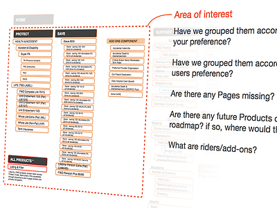
UX Artefact example #004 - UX is not always sexy
Process is more important than polished product when talking about UX Projects. It can be challenging to showcase a lot of the output from early UX stages, plus, a lot of it can be fairly boring to look at..
This piece forms part of a presentation deck I created to explain the working process and subsequent next steps. Having introduced the concept of IA's and sitemaps (differences) to the client, it was at this particular point I would explain how, where and on what elements would I be requiring their feedback.
This project spanned five different countries and 6 different languages, though everything was hosted, communicated and created in English, all the final outputs were translated locally afterwards.
Although this particular client 'got' UX, the presentation itself was in most part an education and explanatory piece ahead of some workshop activities, hence why I proposed and carried out this working method.
For more UX and design talk follow me http://twitter.com/harrisonUX
