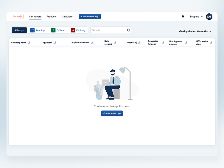
Empty states
It's crucial to inform the user about taking the first step. Instead of presenting a blank page, we have incorporated a vibrant graphic and a Call-to-Action (CTA) button on the empty stage.
It's as simple as that; users will now have a clear understanding of what's happening and what they should do next.
Give us a like if you find it's helpful :)
More by iwoca View profile
Like


