Rum Club Branding - Strong Waters Rum Society
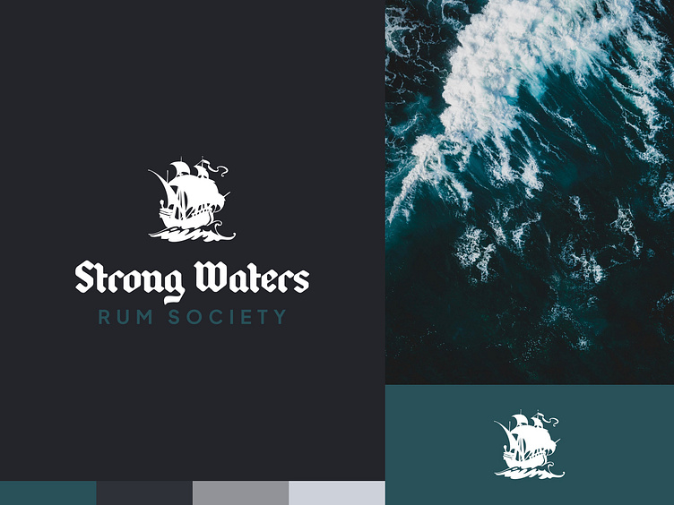
I'm working on a new brand for a local rum club in my community of the Fox Valley in Wisconsin, USA. We wanted something that created a sense of adventure & discovery and was nautical in nature without being overly so.
Typogaphy
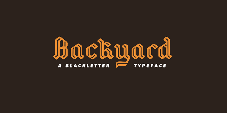
For the display font, I used Backyard by Mans Greback. It's been a favorite of mine for a while. It strikes a great balance between looking like an old-world blackletter script but also has some modern aspects which make it perfect for our brand. It gives it a piratical vibe without becoming cartoony.
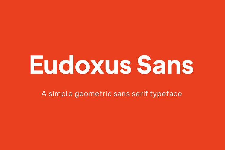
For the body text, I wanted something geometric with a lot of weights for me to choose from. I found. Eudoxus Sans and it works great. It's very versatile, easy to read and gives everything a clean look.
Color
I wanted the brand color to evoke thoughts of the ocean and went for a greenish blue color. The rest of the palette is shades of cool grays, with the intention of putting it all together as a dark theme.

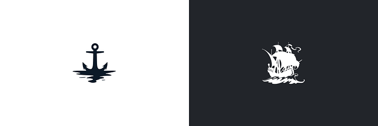
Logomark
I wanted the logo to include a graphic that would be strong enough to use on its own when space is limited. That way it could serve as a favicon, avatar, or things like that in the future. I initially thought I wanted to use something like anchor but eventually I found a sailing ship glyph I liked and it felt much more dynamic with its motion, low angle and evocative feeling.