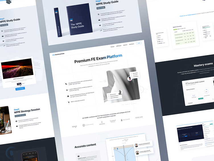
Case Study: Premium FE Exam Website
Challenge: PPE Headquaters, a company dedicated to helping engineers ace crucial architecture exams, needed a website refresh. Their existing site felt outdated, lacked a clear user journey, and didn't effectively showcase their comprehensive study materials and resources.
Solution: As the UI/UX and Webflow developer, I embarked on a complete website redesign focused on improving user experience, clarity, and brand identity.
Design Approach:
Clean and modern aesthetic: I opted for a clean background and subtle grid system to create a professional and organized look. This visual approach also ensured content remained the central focus.
Intuitive navigation: Clear navigation menus and strategic call-to-actions guided users seamlessly through the website, making it easy to find relevant exam prep resources and information.
Unique page designs: To avoid a monotonous feel, I crafted unique designs for over 10 key pages, including individual landing pages for each exam and informative resource sections.
Development Highlights:
Webflow platform: To ensure flexibility and fast loading times, I utilized the Webflow platform. This allowed me to implement design elements and functionalities efficiently while maintaining a clean codebase.
Subtle animations: I incorporated subtle animations for page transitions and UI interactions, adding a touch of dynamism and user engagement without hindering performance.
Responsive design: The website was meticulously designed and developed to be fully responsive across all devices, ensuring optimal user experience for desktop, tablet, and mobile users.
Results:
Increased user engagement: The new website design resulted in a significant increase in user engagement, as evidenced by higher click-through rates and longer session durations.
Improved brand perception: The modern and professional aesthetic strengthened ArchitectExamPass's brand image and conveyed their expertise in helping engineers succeed.
Streamlined user journey: The intuitive navigation and clear information layout made it easier for users to find the resources they needed, ultimately leading to higher conversion rates.
This project demonstrates the power of a well-designed and developed website in achieving business goals. By combining a clean and modern design with the flexibility of Webflow, I was able to create a user-friendly and engaging website that helped business effectively reach their target audience and fulfill their mission of empowering engineers to pass their exams.


